There are thousands of satellites orbiting Earth right now and most are observing the planet in one way or another. Satellite technology is undergoing a change from old and big machines to new fleets of microsatellites with hundreds of cubesats small enough to fit in your backpack. Meanwhile, their counterpart on the surface is changing from complex contracts and sluggish processes to user-friendly and flexible services. This change is in its early stages and it’s going to result in improving availability and flexibility in the near future.
The right time to look into the opportunities offered by satellite data is right now.
For over a year, we at Futurice have been researching the use of satellite data in multiple domains. We’ve worked with Skywatch and their platform Earthcache, which offers us an easy way of ordering satellite images.
When to use satellite data?
Even though satellite data is easily available already, it’s important to understand a few things behind the scenes. The two biggest factors affecting availability are weather and satellite orbits: poor weather prevents getting the images and you can only define the date of capture, but not the time of day. You can order images for “next Thursday”, but “3 PM next Thursday” is too specific. And while you can request data from a single day, you might not be the only customer in line. So, to ensure the results you need, you should consider using longer time spans.
Satellite data comes in different resolutions, measured in meters per pixel, with a low resolution of 30 meters per pixel and a high resolution of 0.5m per pixel. In the low resolution images, forests, roads and fields can be identified. Medium resolution – around 3 meters per pixel – is enough for buildings and other big targets. And with high resolution data you can detect vehicles and even individual humans. Different resolutions are priced differently, so make sure you use the appropriate resolution for what you’re doing.
In my opinion, the optimal case for satellite data in general is something that is continuous, has big enough outdoor assets to monitor and can be split into fine and coarse monitoring. With coarse monitoring, the monitored areas could be reduced into more interesting areas that could then be properly monitored with high resolution data.
What exactly is satellite data?
Satellites offer a variety of data types. For most, the first one that comes to mind is a format familiar from plain old cameras. The platform we use calls it True Color format, but one could also call it a photograph. It’s an image built from red, green and blue bands of light. For the human eye, this is the most useful, but for automatic monitoring purposes we have also other, better options.
One notch up from True Color images are Panchromatic images, which are created by combining multiple bands of light into a sharp monochromatic image. This process creates sharper images than the basic True Color photos, but are missing colors. That might be valuable for identifying objects in images.
For more specific cases, like vegetation monitoring, there are computed outputs, like different kinds of vegetation maps. The one we have been using is called Normalized Difference Vegetation Index. It is based on the certain wavelengths of light green plants are absorbing and reflecting. The end result is a false color image where each pixel indicates how much vegetation is in that area.
The most interesting output available from some satellites is not a photograph at all. Some satellites use radio waves instead of light. These Synthetic Aperture Radars act as moving antennas sending and receiving radio signals. Radio waves are transmitted through clouds and in darkness, making it possible to monitor areas in the middle of a hurricane. The end result is a detailed heightmap of everything on the surface. High resolution SAR data is still quite expensive and not commonly available, but in the near future it could fundamentally change how satellite monitoring works under different conditions.
Case study
To prove the effectiveness of automated vegetation detection solutions, we received real-world examples of vegetation management from a Finnish energy distribution company. A small geographical area with the coordinates of overhead power lines and poles was used to create a satellite pipeline for on-demand images of the area.
The first step was to get the data based on the coordinates. Because the minimum order was 25km², we decided to order the whole general area. We had some initial problems getting the data because of cloudy weather and insufficient timespans, but it was a good lesson in the patience needed with satellite data.
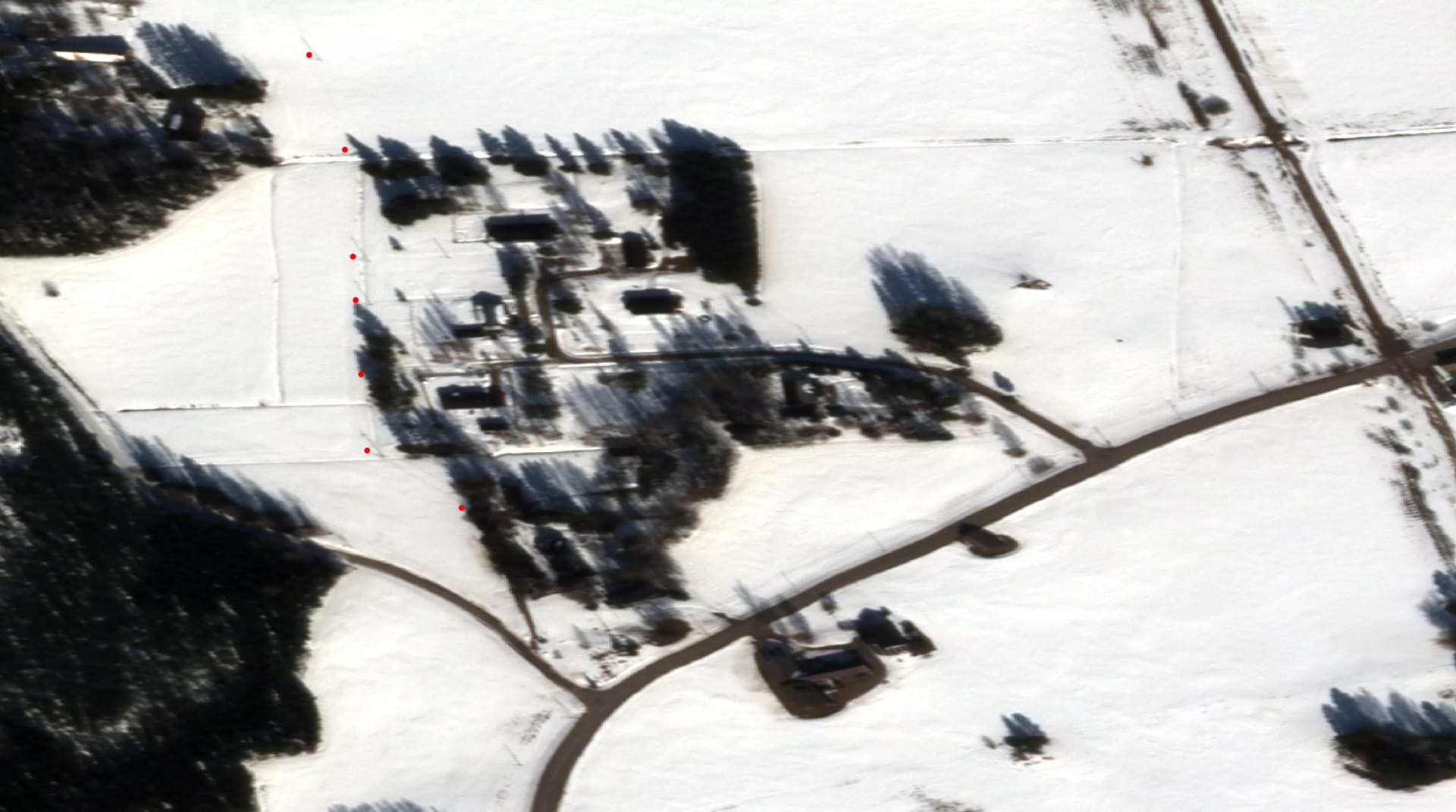
Our initial order was for True Colour images. The data had 0.5m per pixel resolution, which is as good as it gets. As can be seen in the image below, the data does not seem really useful at first glance. The time of the capture was in the morning of a day in March. For such an early time of day in clear and sunny weather it means the sun is still low and the shadows long. Buildings and roads are easy to identify, power line poles can be seen in the snowy fields and, as the red dots on the image indicate, our power line data aligns really nicely.
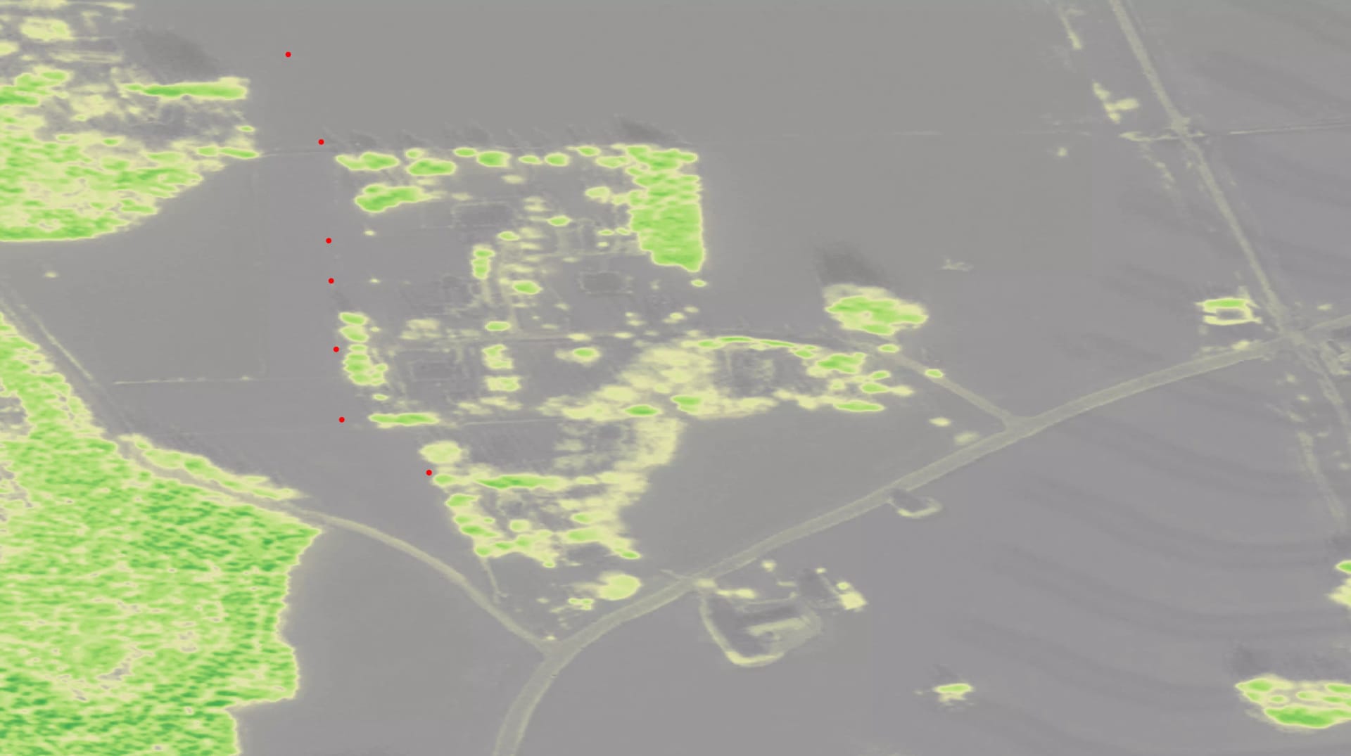
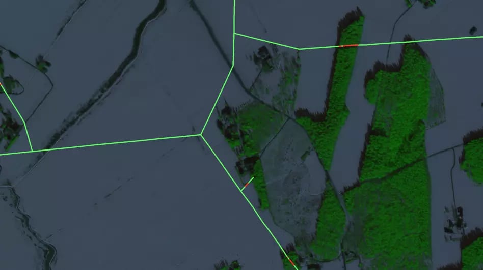
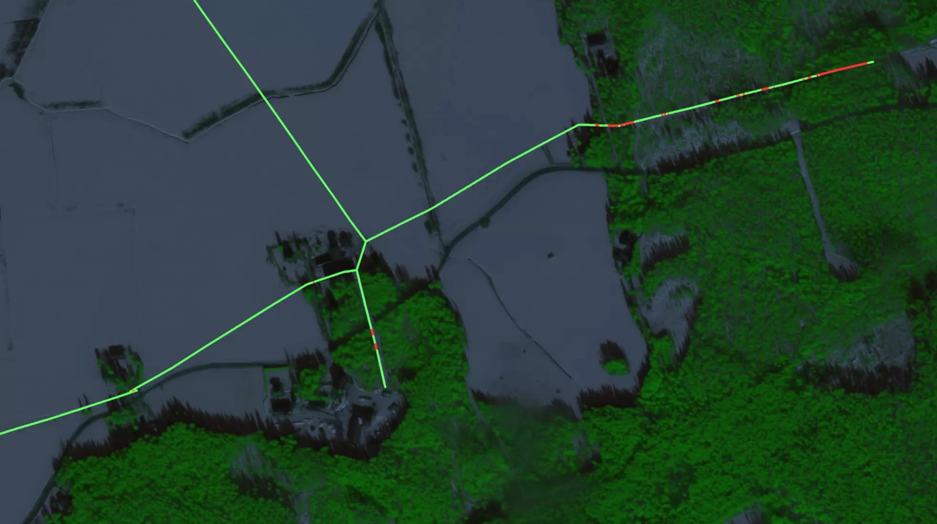
After a visual evaluation of the True Colour images, we moved forward and started to get deeper into the vegetation status. One option we had available was a false color image depicting the Normalized Difference Vegetation Index, NDVI. In the example images we have here, it’s shown in green. The brighter the green, the more vegetation there is on that pixel. In contrast to the True Colour image above, here we can easily see the location of the vegetation. A snowy winter makes the images even clearer.
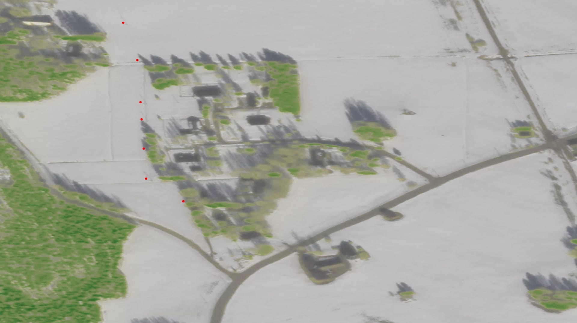
Both these data types have their strengths and weaknesses. The negative side of NDVI images is that, for example, buildings and other features are not that clearly visible. For human eyes, we can combine the outputs and show the vegetation index as an overlay on top of True Colour image. That way we can both see the details of non-vegetation areas and the vegetation without any extra shadows.
The actual data analysis was done using the vegetation index. With this resolution, a single pixel in the data represents a 0.5mx0.5m area. The analysis was made by calculating the nearest pixel to a point in the power line, with vegetation value above a threshold. All segments of the powerline closer than 1m to the nearest vegetation were marked as red. A couple of examples can be seen in the images below. A higher level evaluation indicates that the analysis is useful for specific situations.
What advantages can electricity distribution companies get from satellite data?
This kind of vegetation monitoring in the electricity distribution context can be helpful in many ways. It won’t replace all other methods, but at best it can complement them in a way that enhances fault prediction and prevention. And it does it automatically.
Many electricity distribution companies use helicopters to survey grid equipment. While filming the overhead wires, the helicopter can also laserscan the general area for potential vegetation problems, but this is done only every four or five years. Being able to easily get up-to-date information about the vegetation between the helicopter runs can help monitor the grid.
In addition to continuous monitoring, satellite data could be used in more situations that come up suddenly, like storm damage assessment. During the storm and immediately after, poor weather and tight schedules might limit data availability, making the use of satellite data difficult for acute damage spotting, but over a longer timeframe detecting emerging problems and preventing further damage might be possible, especially in hard to reach places.
Even without storms, there might be changes in vegetation in critical areas. Some forest owners might do some thinning or clear-cutting, but leave some trees too close to the wires, which could then be prone to falling on the powerlines. Satellite data could be used to spot potential problems like this before the actual damage occurs.
In 2019 a Finnish electricity distribution company had an average of 5347 kilometers of power lines. With the platform we have been using, satellite imagery for a minimum area of 25km² can be ordered for as little as $250. The area of interest can be limited to an area 100 meters wide, covering only the actual wires, so the whole electric grid could be covered for less than $6000. Smaller areas can naturally be monitored at a much lower cost, based on need.
Satellite data can be useful
Satellite data can detect vegetation and large objects well enough to be useful as an additional tool for grid monitoring, but it’s not precise enough to replace closer inspection done with helicopters or on location.
In our case study, comparing the results from computer-predicted problem areas with real life observations resulted in very similar results, thus proving satellite images as a viable method to provide power grid management with additional tools.
Automatically triggering work orders based on this data might not be the first thing to pursue at this point, but the pre-screening of areas for an operator to go through reduces the amount of busy-work. It’s a cost-efficient way to find potential problem areas.
Comparing pictures from previous years also makes it possible to automatically point out only the areas that have had significant changes, further lessening the need for manual work. When an area flagged as a problem by the machine is checked on-site and determined to be safe, we need to focus on it again only when something changes more or less dramatically.
 Mikko PohjaMaster Builder, Emerging Business
 Lauri AnttilaAlumni
