Tools that we, designers, tend to use nowadays are naturally playing a significant role in our choice of frameworks and the design process. For years we’ve been stuck with Photoshop and Illustrator trying to achieve web pixel excellence with tools hardly designed for that. Of course, there were plugins and actions supposed to make the life a bit more efficient and save time on the mundane tasks. Yet to mildly put it, available choices were pretty dull.
Then there was the arrival of Sketch. A tool that has become a ‘go to’ choice for UI/UX nowadays. (Sorry, Illustrator fans, it is what it is). After Bohemian guys collaborated with InVision on introducing Craft and other handy plugins, Sketch taking a strong stand as a primary UI tool would naturally seem to be the end of a painful search, since why not?
It comes as no surprise, that we live in a fast-paced world and there’s always an opportunity for companies to launch yet another tool and see how it flies with the designers in need out there. However, if it was just another start-up with a daring dream, then I wouldn’t be writing this post now, since, well, they come and go…
Yet, so it happened, that one of the giant (some say notorious) creative software companies on the market finally realised that when there is a demand…it’s time to come up with something new. Not just by tuning up existing solutions to keep them arguably competitive, but coming up with a separate product, sharpened up specifically for creating digital services.
You have already figured by now that I’m talking about Adobe, right?
Previously announced as Project Comet, Adobe XD has been creating buzz within design circles for quite some time now and it has become increasingly difficult to ignore. XD came straight from the Adobe Sneaks kitchen, where teams experiment with promising technologies, ideas and what not before (if they’re lucky) getting a green light. Now, 2 years later, XD happens to be in the spotlight of everyone’s attention after some promising updates and a showcase at MAX San Diego in November.
But is XD actually any good? Does it live up to the hype? Well that’s why I’m stealing your time here :)
(OK Spoilers: It is actually that good. What’s more important is the why…)
What’s inside
There have been several Mac releases so far, including the recent addition of essential layers/symbols and…drumroll…Windows version that was just released in December. Support for the Surface Studio is only a matter of time now.
The current state of Mac BETA version is already sufficient for creating an end-to-end project. Prototyping, sharing, commenting features are finally within just one tool. No doubts, this basic set of features is relevant enough to be considered seriously and here is what those are about…
General features
Welcome screen
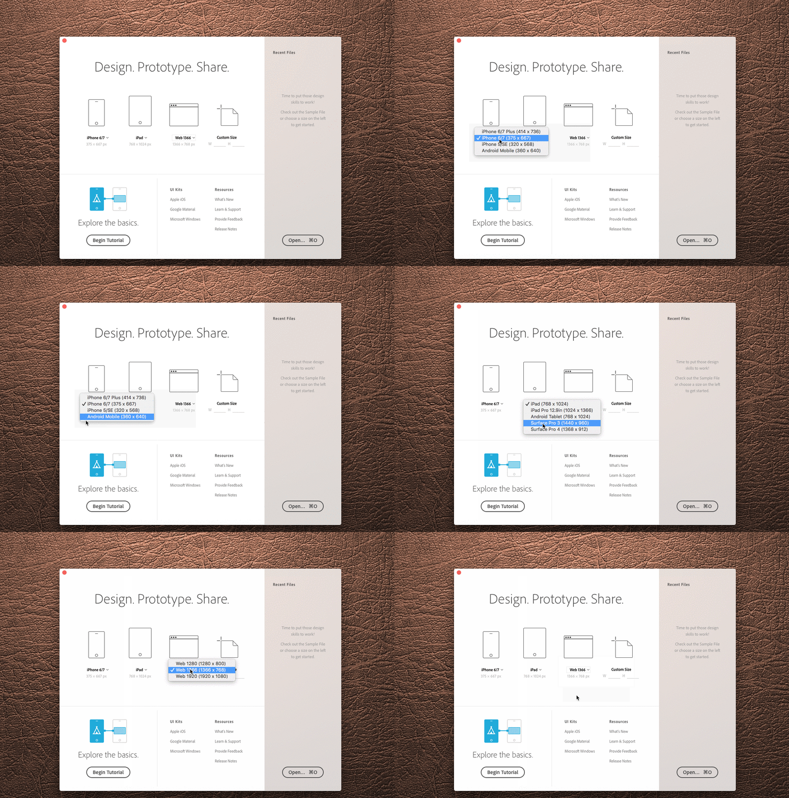
XD launches with a standard handy dialogue showing the device model and screen resolution to begin with. Tutorials and shortcuts for other goodies are there at a glance as well. Soon there will be an overview of the recent files and shortcuts to the ones used the most.
UI Kits (Apple IOS, Google Material and Microsoft Windows)
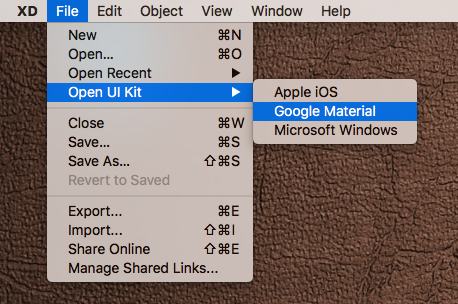
Either you access these from the welcome screen or from the menu bar later, convenience of having the native UI Kits built-in is significant. Simple and genius.

Design Mode
Basically this is a mode in which you design your screens, elements and other fancy stuff before switching to the prototyping mode.
Artboards
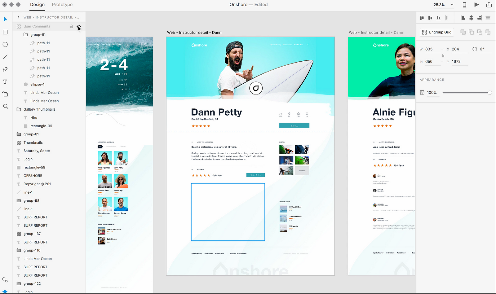
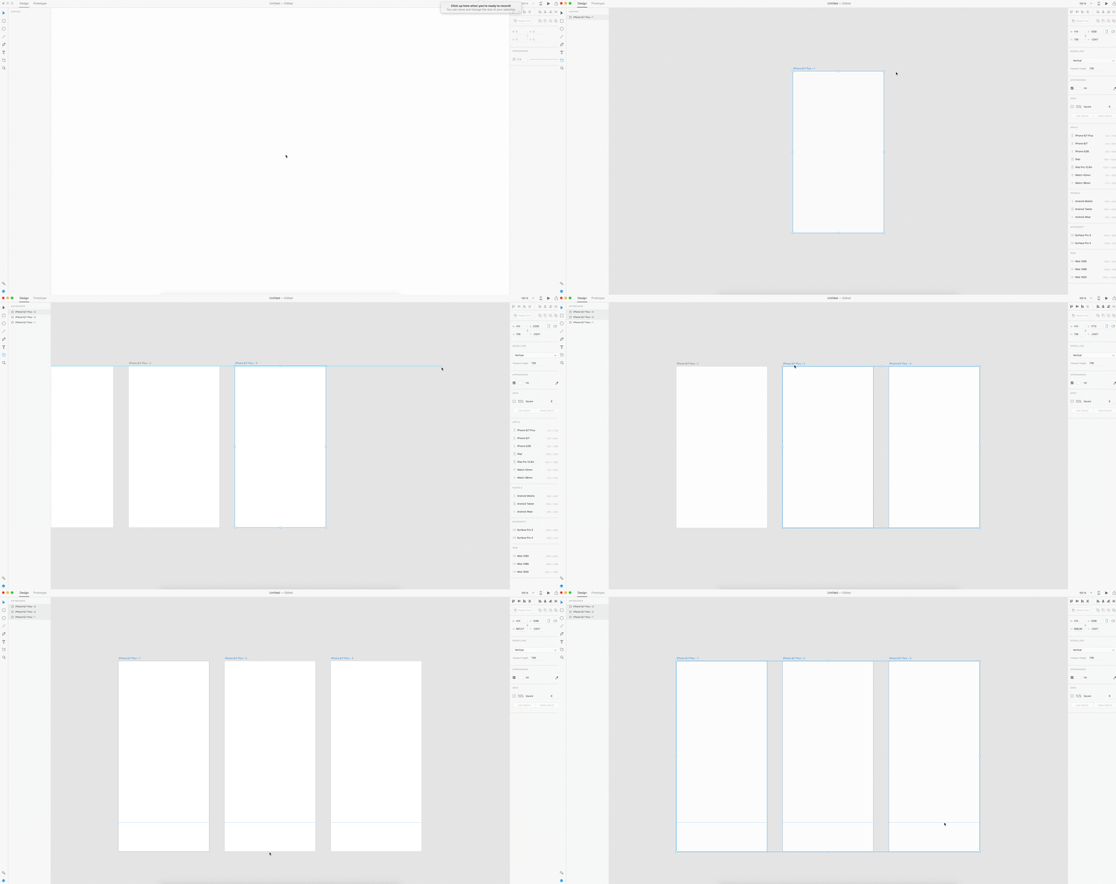
Whilst the Artboard control is somewhat standard, the small sweet feature Adobe added is ‘the fold indicator’. As it might be clear from the name the dotted line, appearing when extending the Artboard height, indicates the beginning of the scrollable content. If you set scrolling from the right panel to ‘none’ you’ll obviously get none :)
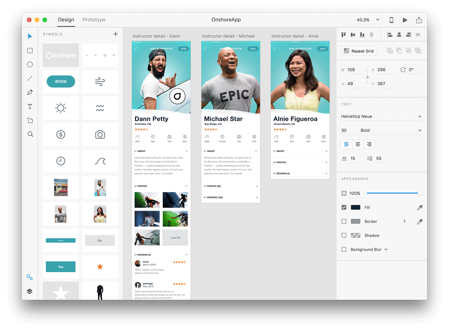
Property Inspector on the right provides sufficient information, related to the tools/objects being selected. Options might vary, but generally this is a go-to panel to change any colour, size, shape related properties and many more.
Layers
XD has a smart layers panel, containing all the essential controls like editing, visibility, order etc. as well as some smart zoom in/out features and a nesting structure that helps to avoid all the visual noise and mess inevitable when artboards spread around a bit.
Symbols
Similarly to what is already known to Sketch users, you can group and edit your symbols, arranging them among various screens with a full control of the original. A foundation for every UI library.
Repeat Grid
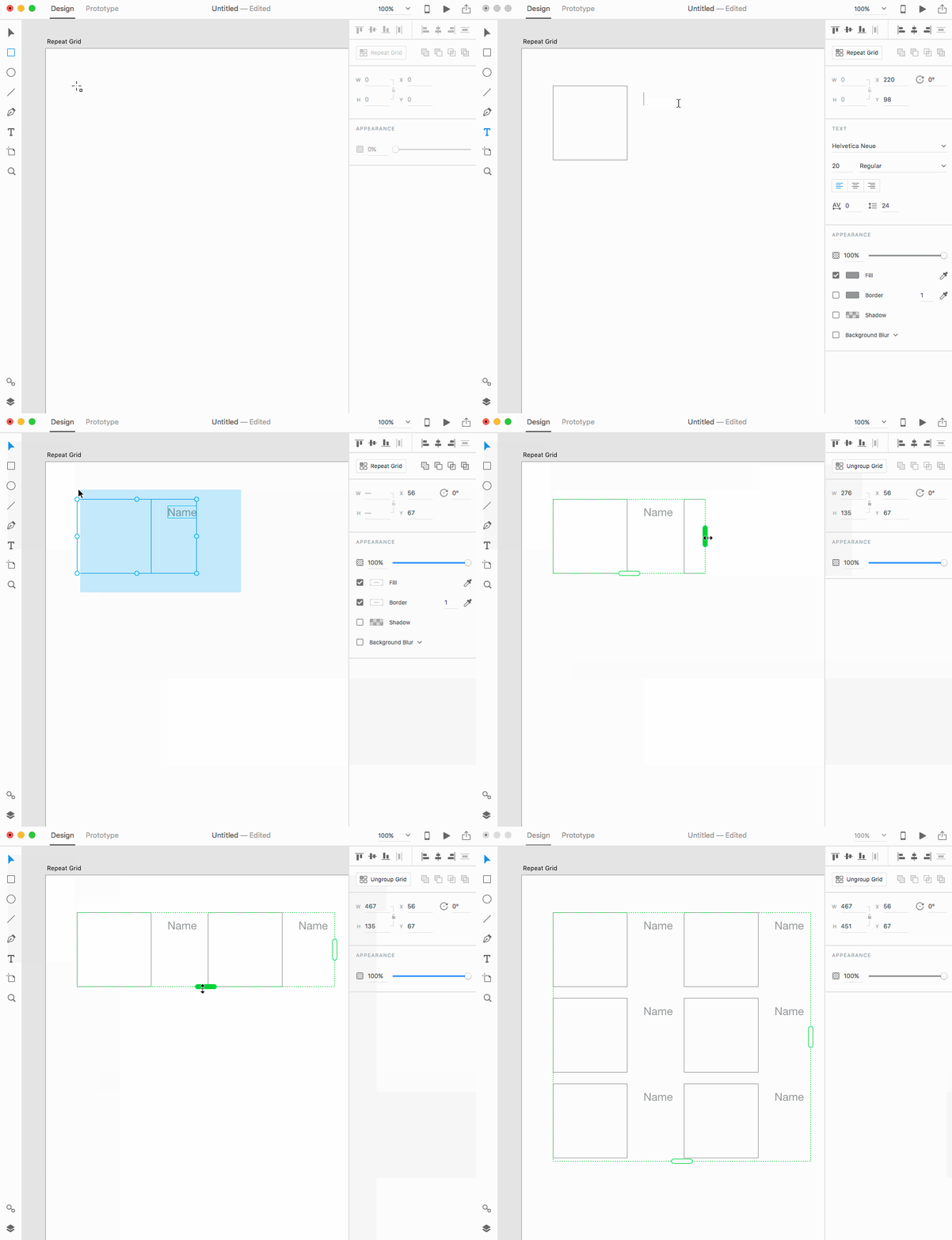
Repeat grid is my personal favourite and initially the feature that made me pay more attention to XD back in the day. It not only improves the performance speed significantly when working on blocks of similar type. But allows to control the content of those blocks, keeping the overall consistency and logic. Loading data from a text file in seconds, replacing visuals, changing hierarchy for multiple elements in one go…all these little things that really make a difference. The way it lets you change paddings and margins within the Grid is as neat and handy as it gets.
Prototyping Mode
Creating transitions
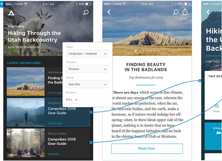
Prototyping mode is mainly about bringing some life and telling a story of the screens designed beforehand. By wiring them together, using simple transitions and basic set of animations, it doesn’t take long to build the flow and share it straight away with other stakeholders for a feedback.
Live Device Preview
To preview your designs on mobile you can use either the IOS or Android App using your Adobe credentials. It updates and previews your designs automatically and basically translates all the changes made on the desktop into mobile practically simultaneously.
The latest December update allows to preview work documents offline as well.

Screencasts
Once the outcome needs approving or sharing, you can output it into a MOV file or a link that can be accessed via browser. It is obviously clickable, so all the transitions and interactions made during the Prototyping mode will be active in the browser as well.
What’s coming up next
Personally, I would love to see AdobeXD focusing on the customised transitions and incorporating some of the Principle features into the Prototyping mode. That would be a kick-ass combo.
However, what XD team announced at MAX was more focused on the general collaboration and design handover, which to be fair is also quite essential.
Any time soon we’ll probably see some of the announced updates in the release:
Developer Handover
Mainly focused on providing a living style guide and design specs in the form of a web link, that would be completely interactive for developers to engage with. Similar to what can be currently seen in Inspector and Zeplin, but as said many times within one tool. Downloading assets, getting measurements and transition descriptions would be a part of it as well.
Version history
An idea proposed in the User Voice community, that has been taken into further development by the team. Speaks for itself.

Other
Styleguides, Live collaboration, Smart grids, Enhanced animations, Real-time Wi-Fi previews, Support for Creative Library and many more…
If you plan to become an active user or even a curious observer make sure to subscribe to XD updates section and follow the Adobe XD User Voice. The latter is set up to collect real users ideas about features that would be useful to have. It also casts some light on the actual background progress and where the team focuses on the most. Members of the User Voice rate the proposed features, report bugs and share the best practices if problems arise.
________
Before I finish off, there is one significant advantage, that designers tend to forget about when praising all the XD perks. And since it’s not purely about tool functionality, I’d like to keep it here as something last but surely not least.
You see, one has to spend some time in the design trenches to realise that a tool being not efficient enough is not the end of the world. After all, we are adaptors, how else would we spend years using Photoshop for web :)
There is a much worse thing — It’s called reality, also known as your client’s IT/legal/whatever department. When that combo bursts in at the beginning of yet another ambitious project and deranges whatever framework that you as a designer is used to… it’s usually no fun for anyone. Nevertheless, it happens often when working with pretty large clients, that have complex internal processes within their organisation. Especially when it comes to the software you are allowed to use as an external.
Naturally it should come as no surprise, that in this case you’ll have to fight against mistrust, suspicion and absolute no-goes towards the common, yet not so well-known design software that is so near and dear to your heart.
In the world where having a Creative Cloud is okay-ish, whilst installing Sketch might be considered as a security breach borderline unleashing the hell on Earth, it sort of makes sense to be focusing on the actual task, rather than getting into the battles that are not worth winning.
And by far the strongest advantage of having XD when it comes to situations like above is its license. CC subscription exists as one and for all, its ecosystem gained some trust in the industry and it generally doesn’t cause much trouble with getting a green light from above. And once these practicalities are set, all the pixels are bound to be yours…
________
To wrap it up
(Congrats, you’ve made it that far)
I’d like to remind that on closer inspection every single UX tool out there has its flaws. Adobe XD is hardly an exception. Yet, as things normally tend to evolve and get better, it’s safe to say that having high hopes for XD won’t be disappointing.
Adobe MAX put a lot of emphasis on the future of collaboration and how community would be at the core of it. Logically, having a product, that meets the very best of UX designers’ expectations for an end-to-end design tool, does sound like a chance to excel at that collaboration and make everyone’s professional life much more efficient. I’m expecting yet another round of tuning up and then XD has a definite potential to take a primary stand on the design toolkit pedestal.
And I’m so looking forward to it.
- Kate PashinovaSenior UX & Visual Designer
