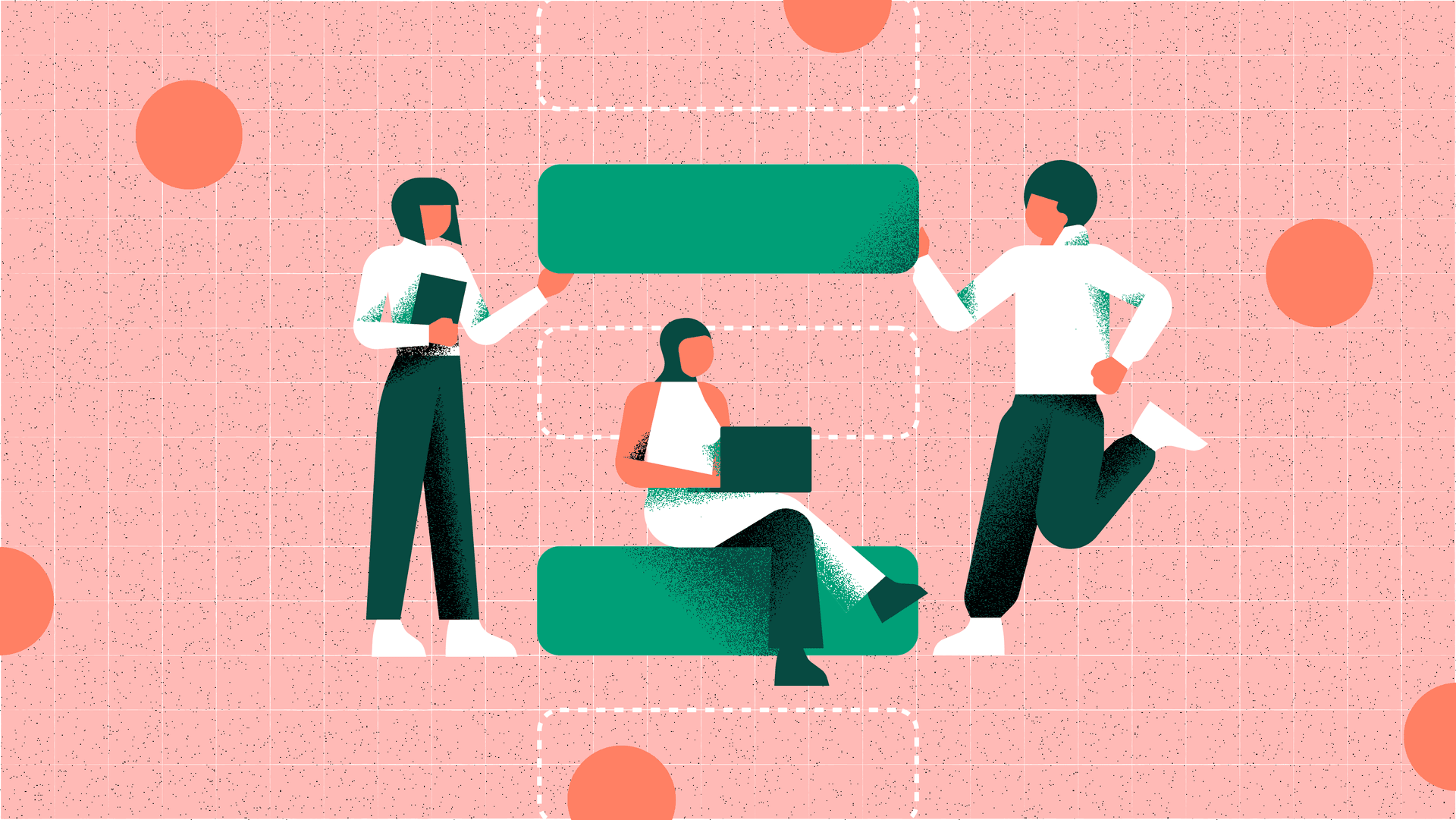
Pattern library playbook: Get set up for success
Over the past decade, the conversation around Design Systems, and their benefits for product teams, has grown to the point where any organisation that isn’t already in the process of building a Library is likely to aspire to starting one.
Index
As the processes and tooling for UX Design work have raced forward at a rate of knots, product teams have progressed from relying on simple Style Guides, to being able to employ these superior tools and processes to explore more robust solutions for managing product assets.
In the dark days before Sketch, Figma and co, when digital products were being designed in Photoshop files living on company servers (😬), the process of creating and managing Design Systems was painful and inefficient. Design teams are now spoiled for choice with new cloud-based UX tools that have lowered the barrier for entry when it comes to creating effective Design Systems.
As with most design processes, there’s no one-size-fits-all approach to creating a Design System for your organisation. With that in mind, in this article we’ll share the approach that’s worked for us, built on a solid foundation of empiricism, which is a fancy way of saying our experience and observations from exploring these things through multiple projects. This article is written primarily for UX and Product Designers, but the techniques and methodologies we cover should be easy to follow for anyone who’s involved in product teams.
It’s probably no surprise that our UX design tool of choice is Figma, but the approach and guidance we’ll share is broadly tool-agnostic and can easily be applied to most contemporary UX design tools. However, if you are still using Photoshop to design digital products, it might be time for a change…
We've created an open Miro board for you to get started, covering everything from planning to process, roles to decision flow. Follow this link and let us know what you think.
What a pattern library is
A cross-discipline single source of truth for product assets, co-owned by Design and Tech.
Let’s break this snappy summary down a little further, and make sure we’re all on the same page by properly defining its key parts:
Cross-discipline – For a Design System to be effective, it needs to be co-created by product teams, not just Product Designers. This ensures that things like taxonomy and naming conventions are consistent and logical to everyone who’s using the system.
Single source of truth – The Library exists in a single location accessible to all teams that require its use. There is a single master version of each asset, which all instances of a master component are linked to.
Co-owned by Design and Tech – Building on the cross-disciplinary aspect of creating the Library, it’s important that designers and developers manage and support it to ensure parity between the assets used by their practices, and to ensure that the Library scales in an efficient and unified way across tools. Co-ownership may require synchronisation across Design- and Tech-specific platforms. For example, Design would own the Figma component while Tech would own the coded implementation of that component within a tool such as Storybook.
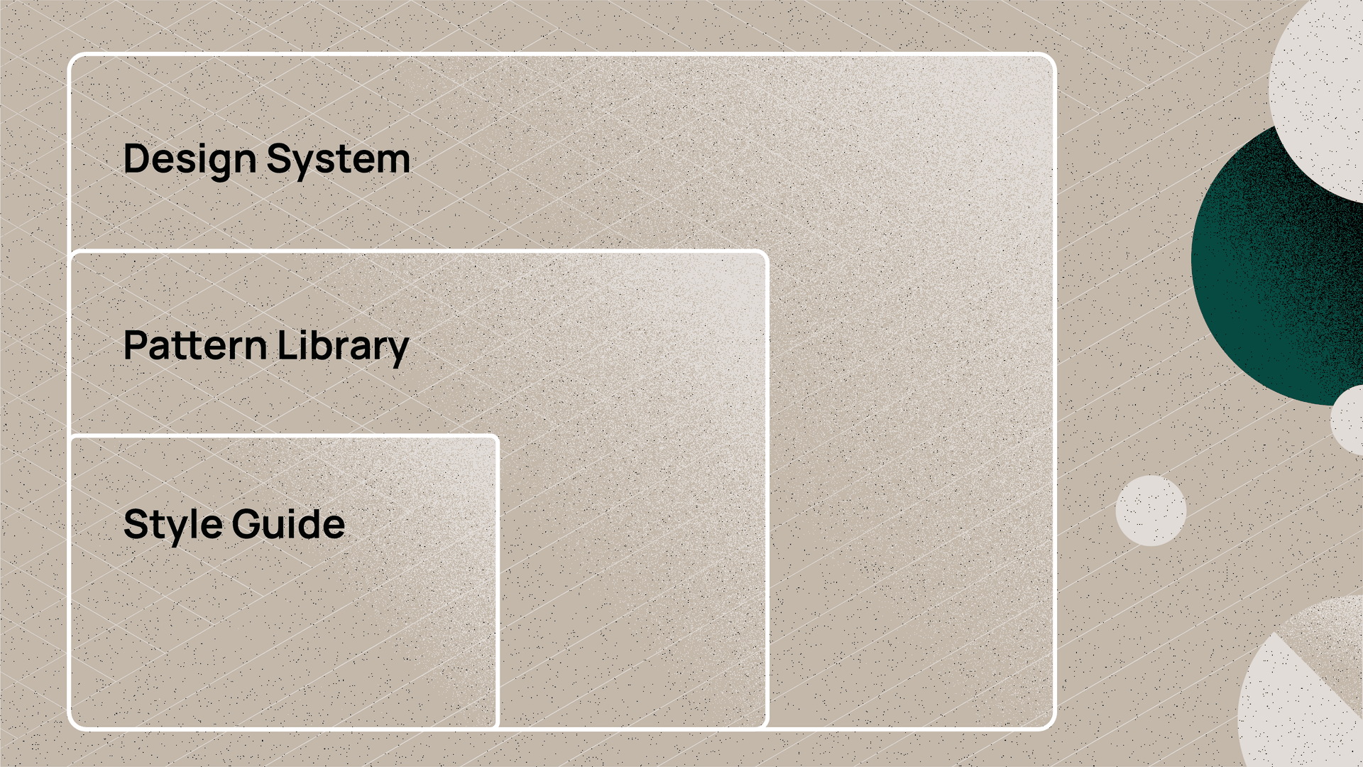
Pattern Libraries vs. Style Guides vs. Design Systems
The more eagle-eyed among you may have noticed us using the terms ‘Design Systems’ and ‘Pattern Libraries’, and have probably been tutting at our inconsistent terminology. Well, this is the part where we explore the differences between Style Guides, Pattern Libraries, and Design Systems, and clarify the terminology that we’re using.
This article is focused on Futurice’s experiences building and maintaining Pattern Libraries. To understand what we mean when we talk about Pattern Libraries, we first need to understand their relationship to other asset management methodologies.
Use our pre-built Miro canvases to get started – follow this link.
Much like brand guidelines, Style Guides help to establish a consistent brand experience across digital touchpoints, which is an important aspect of building trust in users as they interact with your brand. Elements that you would commonly expect to find in a Style Guide include:
- Colour guidelines
- Typography styles and guidelines
- Grids and responsive breakpoints
- Spacing information
- Guides for effects such as elevation
- Iconography and logos
Pattern Libraries
Sometimes known as UI Libraries, or Component Libraries, Pattern Libraries act as a single source of truth for reusable UI patterns, removing duplication and establishing UI consistency across user flows and products. Another great benefit of Pattern Libraries is that they empower teams to prototype and test new or modified user flows rapidly and efficiently, with minimal UX and Tech effort.
A Pattern Library will normally include:
- Responsive component guidelines
- Organised component groupings demonstrating varying levels of complexity
- Clear documentation of interactions and different component states
- Reusable page or view templates
Design Systems
Design Systems provide a level of guidance beyond Pattern Libraries through more in-depth documentation on topics such as component usage, brand and content guidelines and governance processes for modifying and scaling the Design System.
A Design System will normally include:
- Content and Design Principles
- Information Architecture
- Accessibility guidelines
- Code snippets and repository
- CSS variables and design tokens
- Accessibility guidelines
- Governance
- Component usage and details
- Development guidelines, tooling, implementation guides
So why create a Pattern Library instead of a Design System?
The reason we focus on creating Pattern Libraries is that they can be rapidly built to provide product teams with the documentation required to deliver product increments efficiently, while also creating a solid foundation that can be iteratively scaled towards a true Design System.
Jumping straight into building a fully functioning Design System can be a Herculean task for product teams to undertake. It also doesn’t really make sense when building the first iterations of a product (MVP) where the purpose is to get something built quickly. An MVP is often throw-away code, meant to be refactored once the proposition has been validated.
Gall’s law provides a good explanation as to why it doesn’t make sense to start with a Design System
A complex system that works is invariably found to have evolved from a simple system that worked. The inverse proposition also appears to be true: a complex system designed from scratch never works and cannot be made to work. You have to start over, beginning with a simple system.
-- John Gall, Systems theorist
Why your organisation needs a Pattern Library
The high-level benefits of implementing a Pattern Library include:
A shared, single-source of truth
Pattern Libraries help organisations close the gap between designers and developers by giving them a shared language, and a single source of truth to align on for product design.
Faster scaling, less debt
Alongside faster build times, the increased efficiency and consistency offered by a Pattern Library leads to less unnecessary UX and tech debt. Design debt is made up of an overabundance of non-reusable and inconsistent styles and conventions. The interest on that debt is the impossible task of maintaining them.
Improved customer experience
A well-built Pattern Library helps to ensure a consistent end-to-end brand experience, which builds trust with customers and improves overall user experience.
Less confusion
Without a Pattern Library, inconsistencies in the visual identity accumulate, slowing design and development decision-making. Using standardised components consistently and repetitively, creates an application that’s more predictable and easier to understand. Standardised components also allow designers to spend less time focused on style and more time developing a better user experience.
Cross-functional efficiency
Pattern Libraries offer many efficiency improvements, including expediting the on-boarding process for new team members.
What if my organisation needs more convincing?
If your colleagues are still unsure whether a Pattern Library would be beneficial, start by asking them if any of the following statements are true of your organisation…
You’re not happy with the cost and speed of product development You have a number of digital products with shared styles, that are built, developed and managed independently of one another Your product teams are spending a lot of time on redundant design and tech tasks You’ve got a significant amount of tech and design debt, that you can’t keep on top of
A “Yes” answer to any of these statements means creating a Pattern Library would be worthwhile for your organisation.
Show the chaos
If you’re trying to win support for creating a Pattern Library for mature digital products, you can also undertake a quick UX audit to help illustrate the need for a Pattern Library. This can take the form of a simple Miro board containing organised screenshots of inconsistencies in your UI. Fruitful areas for a quick UX audit usually include typography, colour, spacing and variation in styling for common components such as CTAs and inputs, which are often overflowing with inconsistencies.
Every unnecessary variation in colour, typography, or component styling slows down your teams by forcing them to ask which is the right one to use.
The benefits shared here should provide a pretty compelling rationale for building a Pattern Library. However, we’ve found that the best way to convince the decision-makers is to get buy-in from the people doing the work. If your product teams can clearly demonstrate how building a Pattern Library will improve their workflow and efficiency, that’s often the most effective way to get the decision-makers in your organisation to pay attention.
Common pitfalls of creating a Library
Designers creating a Pattern Library in isolation from engineers
This happens more often than it should, when designers get really enthusiastic about creating a Pattern Library and jump straight into designing something before syncing with their engineering colleagues. The design team then presents their shiny new Pattern Library to the engineering team and are met with “this is great, but it doesn’t align with how we work…”
Pattern Libraries are cross-functional tools and, while a lot of the work tends to start in design, to ensure success, it must be coordinated with engineers from day one.
Overlooking governance
A common pitfall is to think of governance as a ‘nice to have’ or something you can do after the Library is ‘finished’. In practice, good governance is an essential part of building an effective Library. A Pattern Library without governance is like a car without a motor; it might move forward, but it won’t get very far.
As we’ve stated before, you can tell there’s no governance when there’s inconsistency, duplication and no clear ownership. Ignoring governance when scaling your Pattern Library is very risky because of the accumulation of effort it requires to clean up.
Not having clear Library owners from design and engineering
This is a part of governance and is equally important to establishing a successful, scalable Pattern Library. Without establishing accountabilities for the Library across design and engineering, there’s a high chance that it'll quickly accumulate inconsistencies and duplication.
Forgetting accessibility
Accessibility best practices should be baked into design processes, not an afterthought. This is true of your Pattern Libraries too, which should provide clear guidance on creating components and patterns that support good accessibility standards. Retro-fitting accessibility into a mature product can be a complex, and costly, task.
Planning your Library
Use our pre-built Miro canvases to get started – follow this link.
Ok, so you’ve convinced your team and organisation that a Pattern Library is the way forward, and everybody’s bought into the prospect of this amazing new tool, but where do you actually start? The first thing to think about is choosing the right starting point for your product. Depending on factors like budget and the need for customisation, you could opt to build your Library on an existing Design System. You can read about the pros and cons of this approach in this handy little article from Nielsen Norman Group.
While our playbook is focused on creating a new Library, many of the techniques that follow can still be helpful when adopting or adapting an existing Library.
Methodology
Before you begin to plan and organise the elements that’ll make up your Library, it’s important to align on a methodology to underpin your approach. At a basic level, having a defined methodology will help your team understand the right way to categorise and organise the elements of your Library. At Futurice, we’re big fans of Brad Frost’s Atomic Design methodology, because of its intuitive approach to organising assets across design and tech, and its focus on scalability.
The Atomic Design methodology is inspired by the composition of matter in chemistry. The approach uses Atoms, Molecules, and Organisms to categorise and group design elements of varying complexity. This might sound a bit complicated at first but, in practice, it's a logical and simple method for creating clear hierarchy and order within a modular Pattern Library.
Why use Atomic Design?
Benefits of Atomic Design methodology include:
- A modular approach to UI – Breaking down complex interfaces into their smallest components helps teams to understand how these components can be combined to create new patterns.
- Simple-to-scale Pattern Libraries – Applying Atomic Design principles keeps designs consistent and scalable across platforms.
- Faster prototyping and iteration – Atomic Design’s intuitive structure offers teams a powerful toolkit of components that enables them to rapidly create new patterns, pages, and user flows.
- Easy-to-read code – Atomically written code is easier for cross-functional teams to follow, creating consistent structure and naming protocols across design and frontend tools.
- Modifications – Developers are able to add, remove or modify atomically written components from page layouts, making change requests easier.
You don’t have to stick with the Atomic Design naming conventions of Atoms, Molecules, Organisms – you can use whatever terminology works best for your team. Brad Frost sums this up best:
“Atomic design” as a buzzword encapsulates the concepts of modular design and development, which becomes a useful shorthand for convincing stakeholders and talking with colleagues. But atomic design is not rigid dogma. Ultimately, whatever taxonomy you choose to work with should help you and your organisation communicate more effectively in order to craft an amazing UI Design System.
-- Brad Frost, creator of the Atomic Design methodology
Identifying what to include in your Pattern Library
Before starting to populate your Pattern Library, it's useful to define what elements need to live in it. We've already looked at the differences and overlaps between Style Guides, Pattern Libraries and Design Systems, and we've discussed the value of creating a Pattern Library that has the potential to scale into a future Design System.
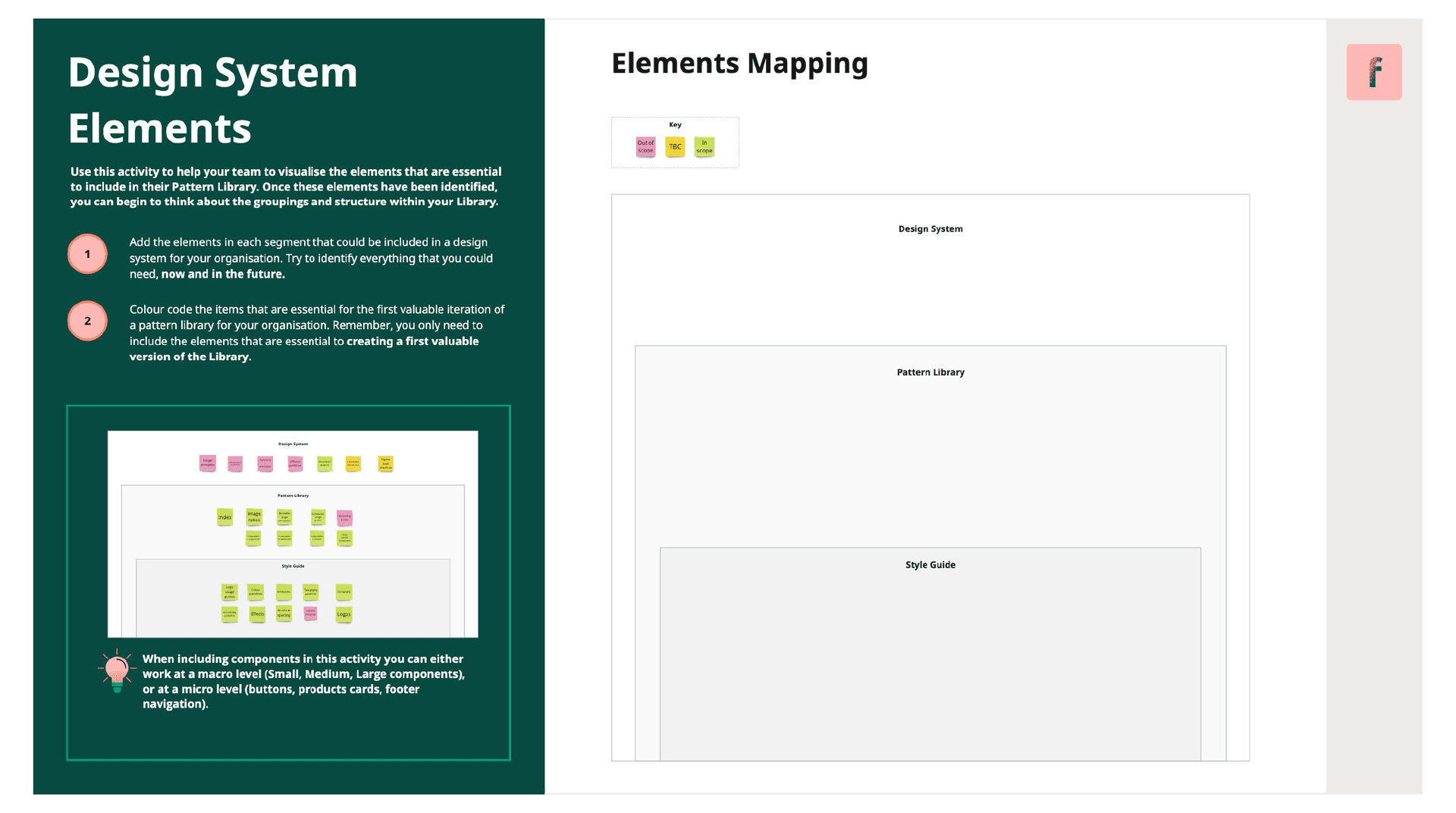
The following activity is a simple way for a team to visualise the elements that are essential to include in their organisation's Pattern Library. Once these elements have been identified, you can begin to think about the groupings and structure within your fledgling Pattern Library.
Use our pre-built Miro canvases to get started – follow this link.
How it works
- Add the elements in each segment that could be included in a design system for your organisation. Try to identify everything that you could need, now and in the future.
- Colour code the items that are essential for the first valuable iteration of a pattern library for your organisation. Remember, you only need to include the elements that are essential to creating a first valuable version of the Library.
💡 Pro tip
When including components in this activity you can either work at a macro level (Small, Medium, Large components), or at a micro level (buttons, products cards, footer navigation).
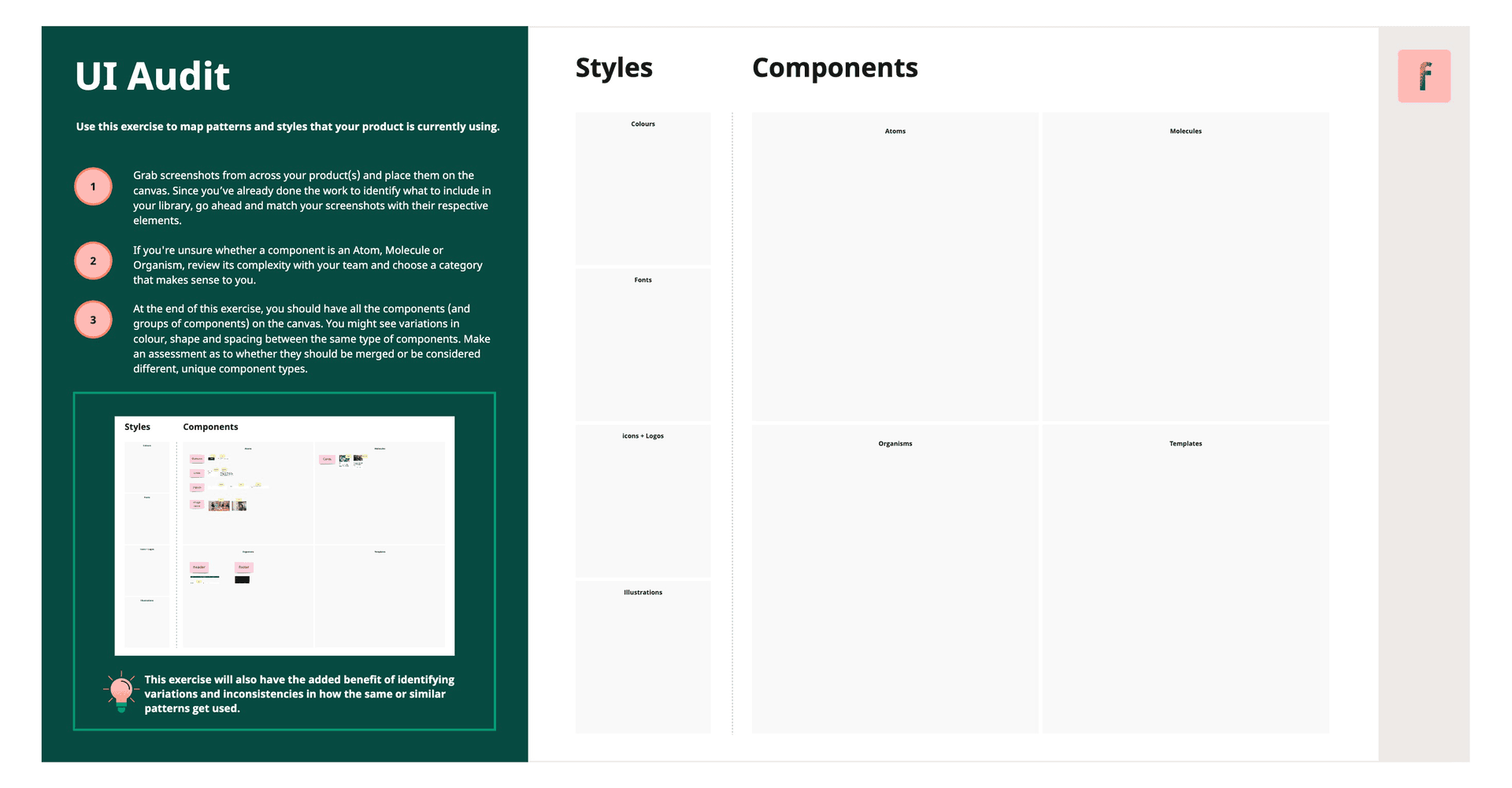
Audit the existing product(s)
In order to set up a Pattern Library that works for your product(s), you’ll need to make sure to map the patterns you’re currently using. The following exercise has the added benefit of identifying variations and inconsistencies in how the same or similar patterns get used.
All you need to do is grab screenshots from across your product(s) and place them on the Miro canvas. Since you’ve already done the work to identify what to include in your library, go ahead and match your screenshots with their respective elements.
How it works
- Grab screenshots from across your product(s) and place them on the canvas. Since you’ve already done the work to identify what to include in your library, go ahead and match your screenshots with their respective elements.
- If you're unsure whether a component is an Atom, Molecule or Organism, review its complexity with your team and choose a category that makes sense to you.
- At the end of this exercise, you should have all the components (and groups of components) on the canvas. You might see variations in colour, shape and spacing between the same type of components. Make an assessment as to whether they should be merged or be considered different, unique component types.
At the end of this exercise, you should have all the components and styles (and groups of components and styles) on the canvas. If you’re auditing a fairly mature product, there’s a good chance you’ll see visual variations in variants of the same type of component, that manifest as differences in size, spacing, colour, etc. You’ll need to assess whether they should be merged or be considered a different, unique component type. Similarly, you might identify colour variables that differ ever so slightly from one another which will need to be merged (this usually happens with greys, for some reason).
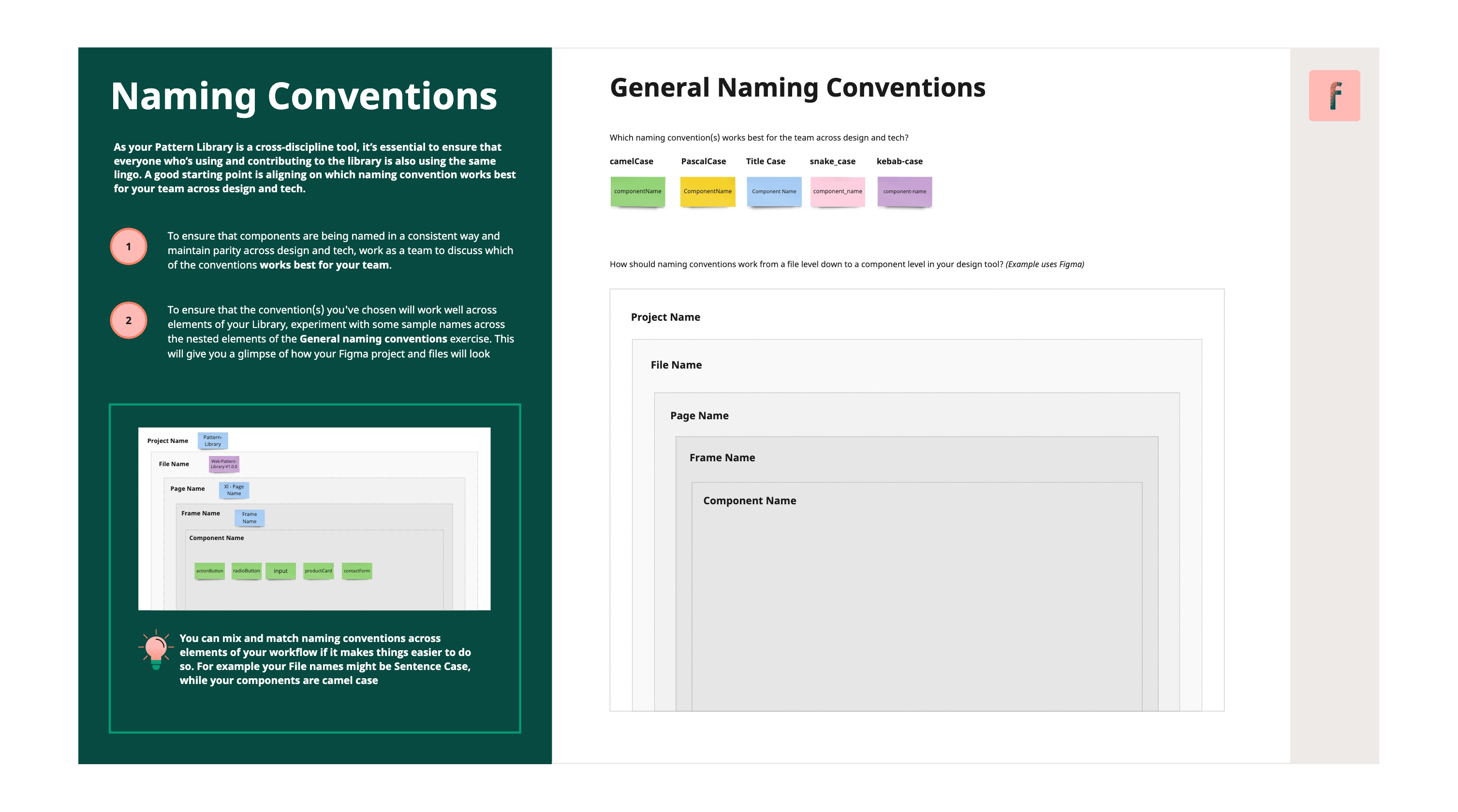
Define naming conventions
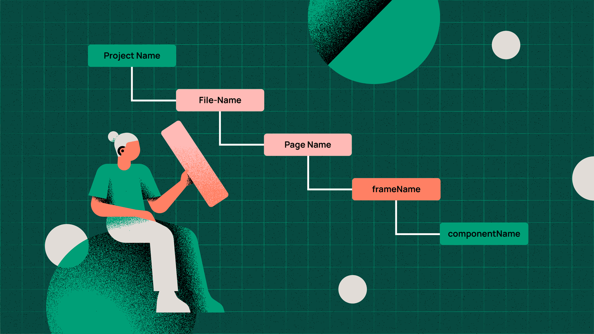
As your Pattern Library is a cross-discipline tool, it’s essential to ensure that everyone who’s using and contributing to the library is also using the same lingo. A good starting point is aligning on which naming convention works best for the team across design and tech.
When it comes to naming individual components, designers and developers should simply agree on the clearest name for a component. In Atomic Design, this starts to become more subjective when naming components that are Molecules or Organisms, especially those that are created specifically for your product. Try to keep naming aligned to established conventions where possible, otherwise just try to keep component names descriptive and logical for your team. Other elements of the Pattern Library that benefit from having their naming conventions discussed and defined with your team include:
- Break points: For example, Small, Medium, Large, vs. Desktop, Tablet, Mobile
- Frames: Define what works best for your team to clearly label artboards or frames in your library. If you’re using Figma, the frame name is automatically prefixed to the name of any components that live in the frame, making it less complex to group components.
- Component grouping: What makes sense to your team when grouping similar components together on a Frame, e.g. ‘ButtonsAndLinks’.
Use the canvas below to explore naming conventions with your cross-functional Pattern Library team, and align on an approach that makes sense to everyone, before getting into your design tools.
Use our pre-built Miro canvases to get started – follow this link.
How it works
- To ensure that components are being named in a consistent way and maintain parity across design and tech, work as a team to discuss which of the following conventions works best for your team:
- camelCase
- PascalCase
- snake_case
- kebab-case
- Title Case
- To ensure that the convention(s) you've chosen will work well across elements of your Library, experiment with some sample names across the nested elements of the General Naming Conventions exercise. This will give you a glimpse of how your Figma project and files will look.
💡 Pro tip – Mix and match
You can mix and match naming conventions across elements of your workflow if it's easier to do so. For example, it might make sense for your team to use ‘Title Case’ for File names, with ‘camelCase’ used for components.
Define the Library structure
Now that you've identified the elements that need to live in your Pattern Library, and selected naming conventions and a methodology for organising those elements, you can start to plan the structure of your Pattern Library.
Let's assume you've chosen to use the Atomic Design methodology. You can now start to group and organise the elements you defined in the ‘What goes in’ exercise following Atomic Design principles. In the example below, you can see how we've created top-level content groups following Atomic Design principles, and begun to group our Library elements under each category. If you're using Figma, these top-level Categories will become Pages, with the elements below each organised onto the frames within these pages. You might have noticed how we've included numbers next to our top-level Categories; this helps our Categories to appear in design tool menus in the order that we choose, rather than in alphabetical order based on the Category names.
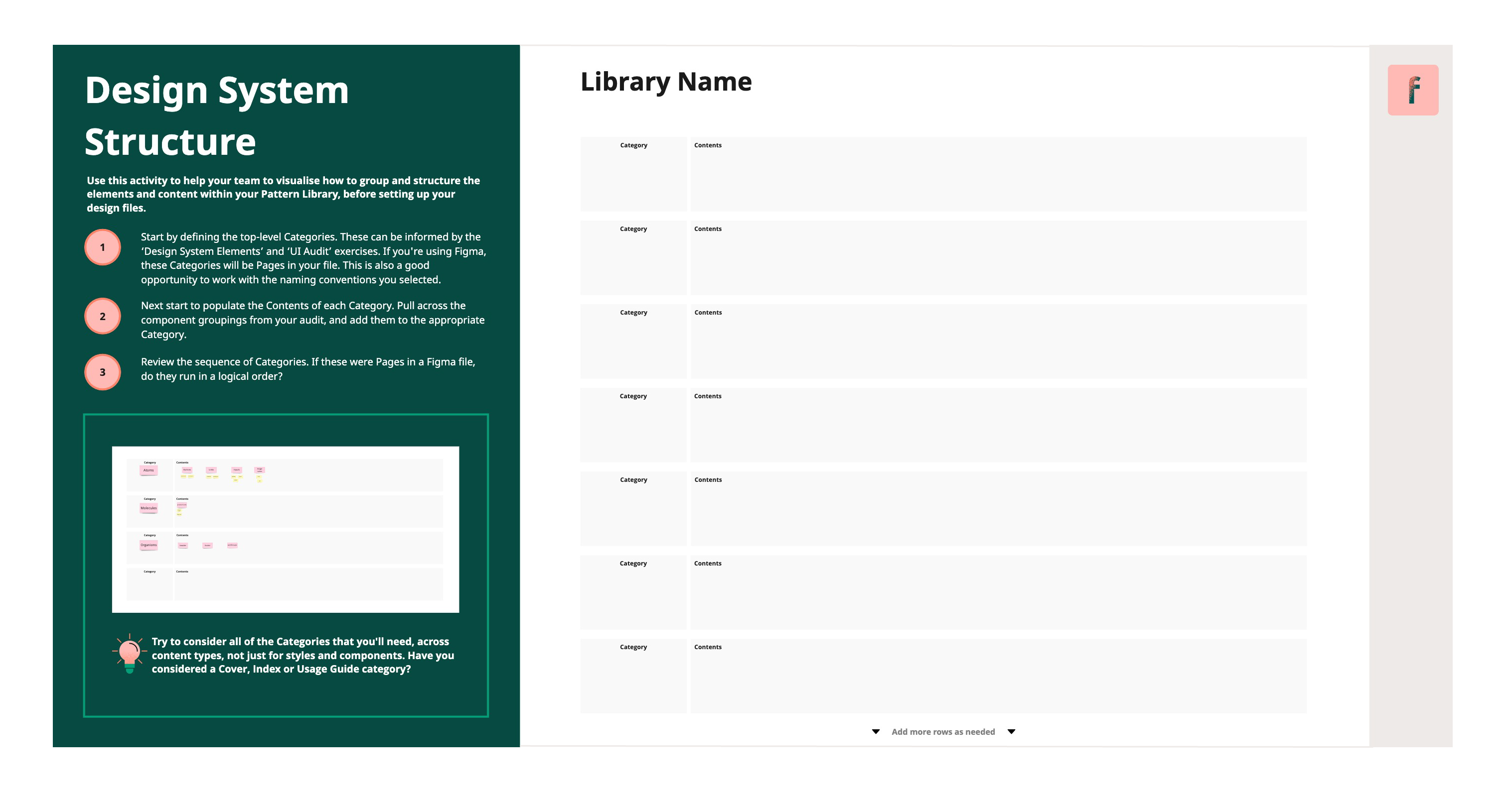
How it works
- Start by defining the top-level Categories. These can be informed by the ‘Design System Elements’ and ‘UI Audit’ exercises. If you're using Figma, these Categories will be Pages in your file.
- Next start to populate the Contents of each Category. Pull across the component groupings from your audit, and add them to the appropriate Category.
- Review the sequence of Categories. If these were Pages in a Figma file, do they run in a logical order?
💡 Pro tip – Component variants
We want to create a Library that achieves an unambiguous experience when working with the components, where users of the Library spend less time guessing and more time building flows, but it can become unwieldy, too.
Tools like Figma give us the ability to give components properties that represent styling and content variations, this reduces the need to use manual overrides that weren’t intended and could lead to inconsistencies. But remember to ask, how much guidance is too much guidance? There’s a point at which a component’s variations become too complex to keep track of and even reduce the efficiency benefits of using variants in the first place.
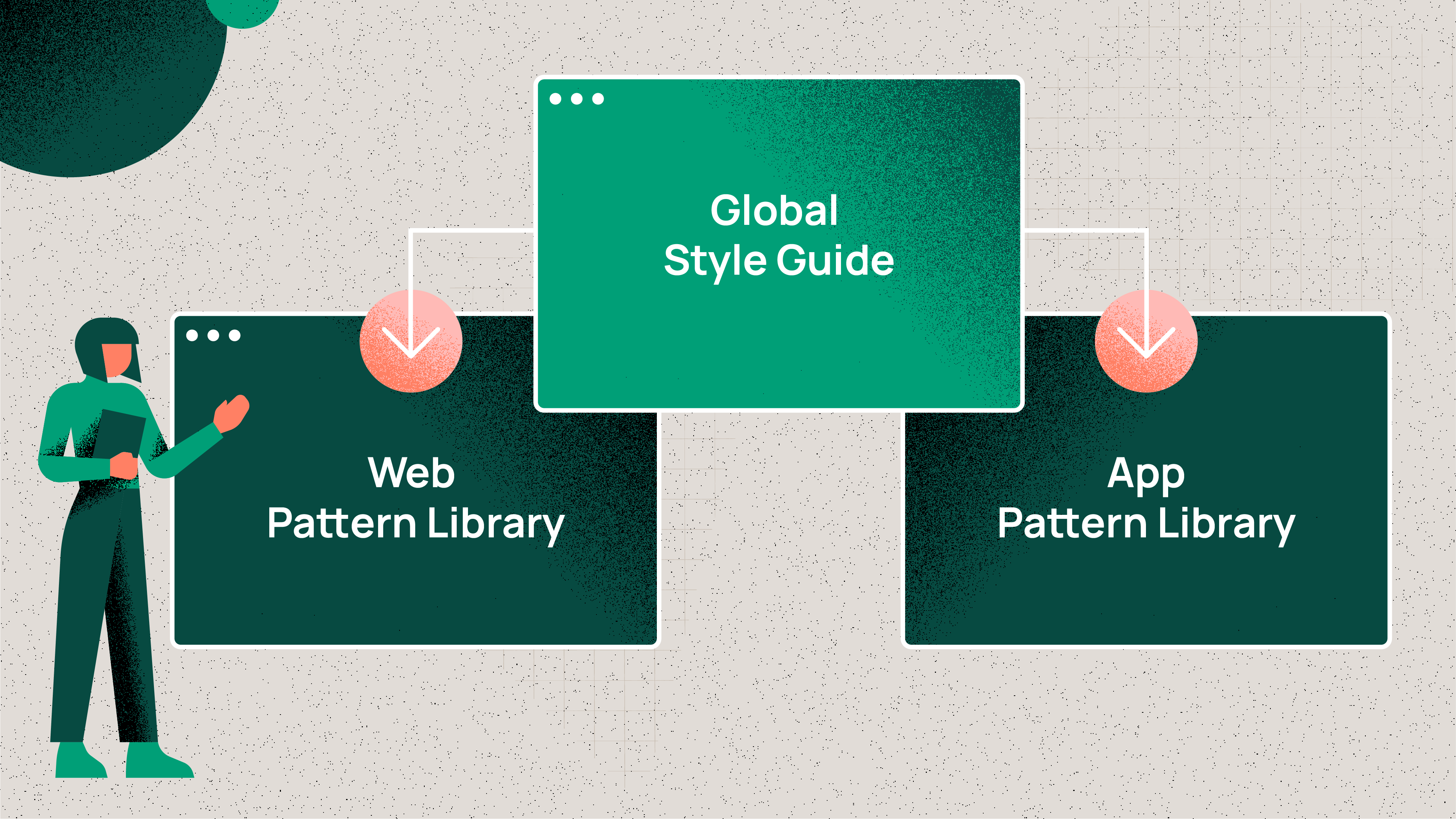
How to approach a multi-platform library
Lets say, for example, that your organisation has a web platform and an iOS app; how should you consider these different platforms when planning your Pattern Library?
We recommend considering a multi-platform approach that caters to projects built on different code bases. This would mean creating separate Libraries for each platform (e.g. web, iOS), supported by a Global Style Guide Library.
For this approach, you should audit these products individually, with a Miro canvas for each, similar to the example below.
 Use our pre-built Miro canvases to get started – follow this link.
But hang on, won’t this approach result in duplication? Good spot, it will require your team to create, for example, separate button components within each platform library.
The important thing to consider from a user experience perspective, is consistency. Designers will be accountable for ensuring that a button component in the iOS app looks like a button component on the web platform, while the Global Style Guide will help to ensure cross-platform brand consistency.
So how does the Global Style Guide work? The purpose of the Global Style Guide is to ensure that fundamental stylistic elements stay consistent across the wider product ecosystem. It’s essentially the Style Guide part of a single Pattern Library separated out into its own file in order to cascade stylistic elements across platform-specific libraries. Meanwhile, the product-specific libraries house actual components. The Global Style Guide should be focused on the following stylistic elements:
- Colour and accessibility guidelines
- Typography styles and guidelines
- Grids and responsive breakpoints
- Spacing information
- Guides for effects such as elevation
- Iconography and logos
Governance
What we mean by governance
Once a team has gone to the effort of putting together a robust, well-structured Pattern Library, it’s essential that they put in place some clear processes and guidance to ensure that collaborators understand how to use, contribute to, and scale the Library. This is where governance comes into play. Without good governance, your shiny new Pattern Library can quickly deteriorate into a mess of inconsistencies and duplication that will gradually chip away at the Library’s value.
When we discuss governance in the context of Pattern Libraries, what we’re talking about is creating a framework that outlines roles, responsibilities and decision-making for maintaining and updating a product's Pattern Library.
Identify roles and responsibilities
The specific roles and responsibilities required for your Pattern Library Team will vary, depending on the size and complexity of your Pattern Library and of your organisation. However, there are some basic roles that all teams will benefit from to ensure a baseline of governance exists.
Pattern Library Team
- Library Design Owner
- Library Engineering Owner
- Brand Consistency Owner
Library Design Owner
The Library Design Owner could be one person or a team of owners, both have pros and cons depending on the size and complexity of the Library. In order to decide which option to go for, consider whether the solitary model could become a bottleneck for the completion of tasks. You should also think about whether a group is likely to be too busy working on other areas outside of the Library, to dedicate the necessary time required to properly oversee the Library.
Responsibilities for this role include maintaining the integrity of the Pattern Library by making sure the governance framework is being followed. They will also be the ones merging and releasing updates in Figma, or any other tool your team uses, that follow the standards and quality that the team has decided previously.
Library Design Owners also need to keep track of how well the Library is performing. This means following up on how well the Library fits the team's workflows and its adoption.
Library Engineering Owner
As the name suggests, the Library Engineer Owner is usually a developer that is in charge of the coded front end components. They will be the ones merging any updates or new additions into a coded Library manager such as Storybook.
Brand Consistency Owner
Product Designers are always prioritising the needs of users, which is why we sometimes design patterns optimised to solve the problem that are not entirely aligned with a brand’s UI guidelines. Having a person, e.g. someone from the brand and marketing team, who is accountable for the brand consistency across all patterns can be a very effective way to make usability and look and feel a top priority without adding cognitive load to your team’s designers.
Define your governance framework
As with roles and responsibilities, the framework you create to govern your Pattern Library can vary greatly in complexity. As a starting point for new Pattern Libraries, there are a few key pieces to set in place to ensure a decent baseline of governance exists:
Framework elements
- Design standards
- Governance process map
- Decision flow chart
- Where to track Pattern Library changes
- How to track Pattern Library changes
Design standards
Setting the criteria that defines what a pattern or update needs to include to be considered done, will help your team have quality control, as well as setting constraints. Most of this applies to both the design file patterns as well as the coded versions, with slight technical differences in scope (e.g. accessibility details). It’s essentially a Definition of Done (a.k.a. DoD) for your patterns.
Examples of these criteria are:
- Accessibility requirements
- Brand consistency
- Pattern adaptability (variants and properties)
- Pattern classification and structure
Governance process map
A governance process map describes how files, tools and workflows are structured. It provides an overview to understand how assets are organised, as well as the high-level relationship processes. Keep in mind that your process map will vary depending on whether you’re building a single or multi-platform Library. A process map for a single or platform Library will likely look something like this example.
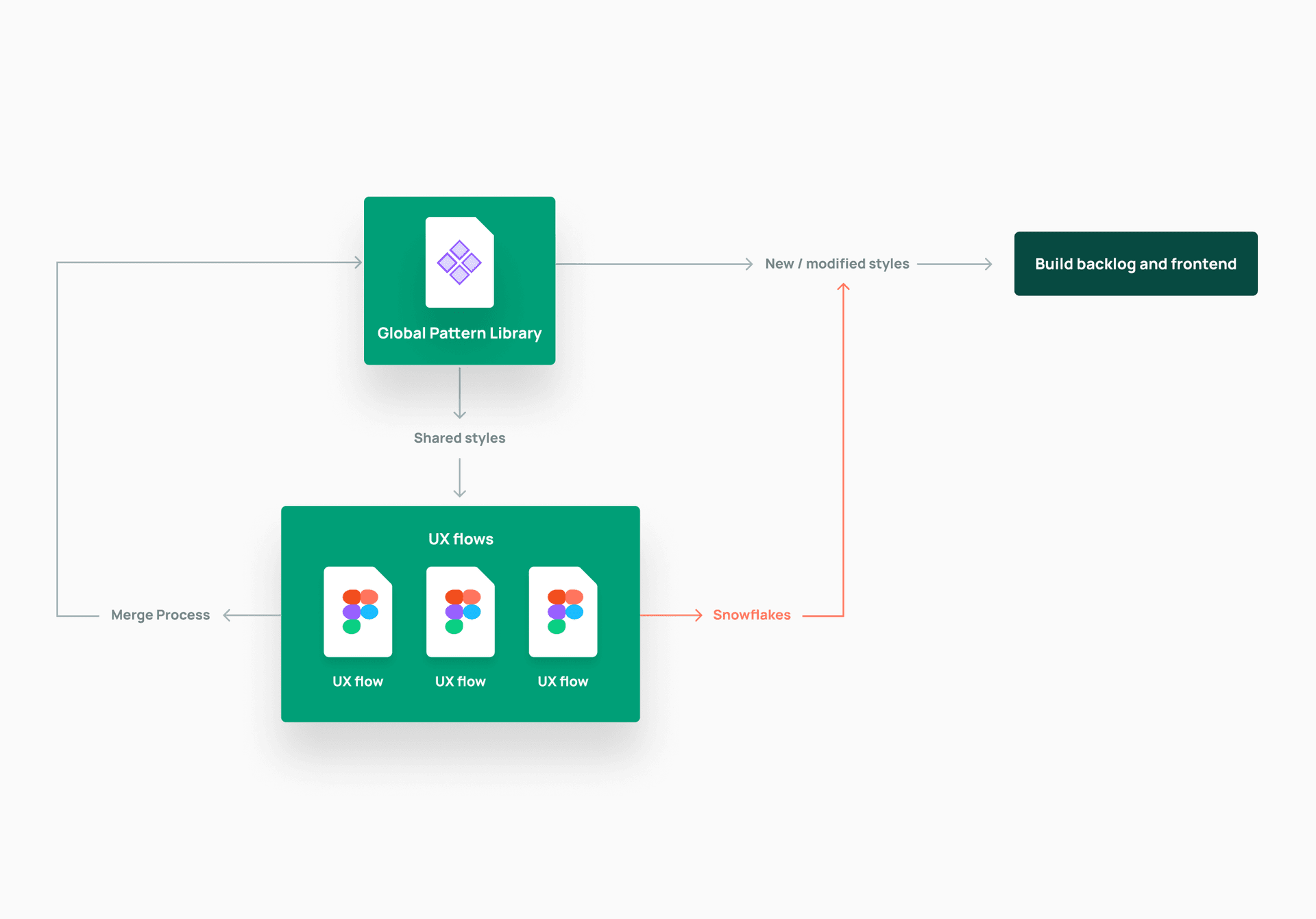
Use our pre-built Miro canvases to get started – follow this link.
While a process map created for a multi-platform Library could look something like this example below. Note the separate Style Guide which cascades through subsequent format specific libraries.
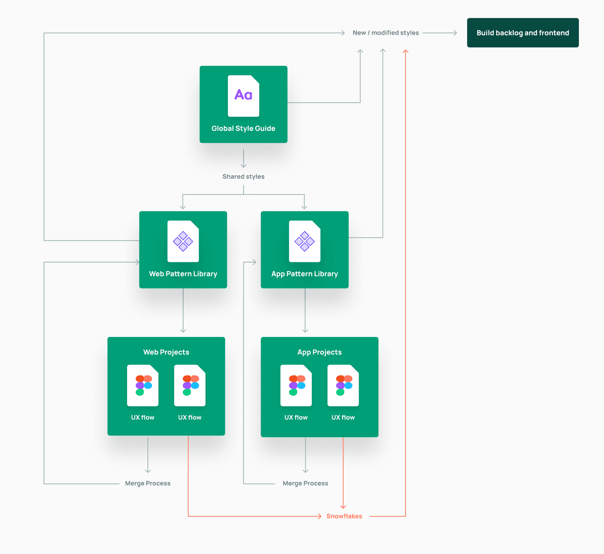
Keep in mind that the two examples above are for example purposes, and solely focus on design tools. Your team will also need to consider the tech elements that will be included in their process map.
When creating your process map, try to consider the relationship between the cross-discipline tools, files, and channels your team will use to build and manage your Pattern Library. These may include:
- Figma files for the Library/Libraries
- Figma files used for specific product prototypes
- Tools used to track changes, such as Jira
- Front end tools such as StoryBook
To map how all of these tools connect and work together, try to capture the journey a component goes on from design files through to being deployed on the front end.
Decision flow chart
Whereas the governance process map provides an overview of the way we organise and structure our files, projects and workflow, a decision flow chart can be used to evaluate when and how changes to the Pattern Library should be made. How does the team decide if a pattern should be added to the shared library, if an existing pattern should be updated to fit additional needs or simply considered a Snowflake?
A decision flowchart can help teams evaluate the right approach quickly and consistently. Here is a simple example or starting point for a decision flow chart:
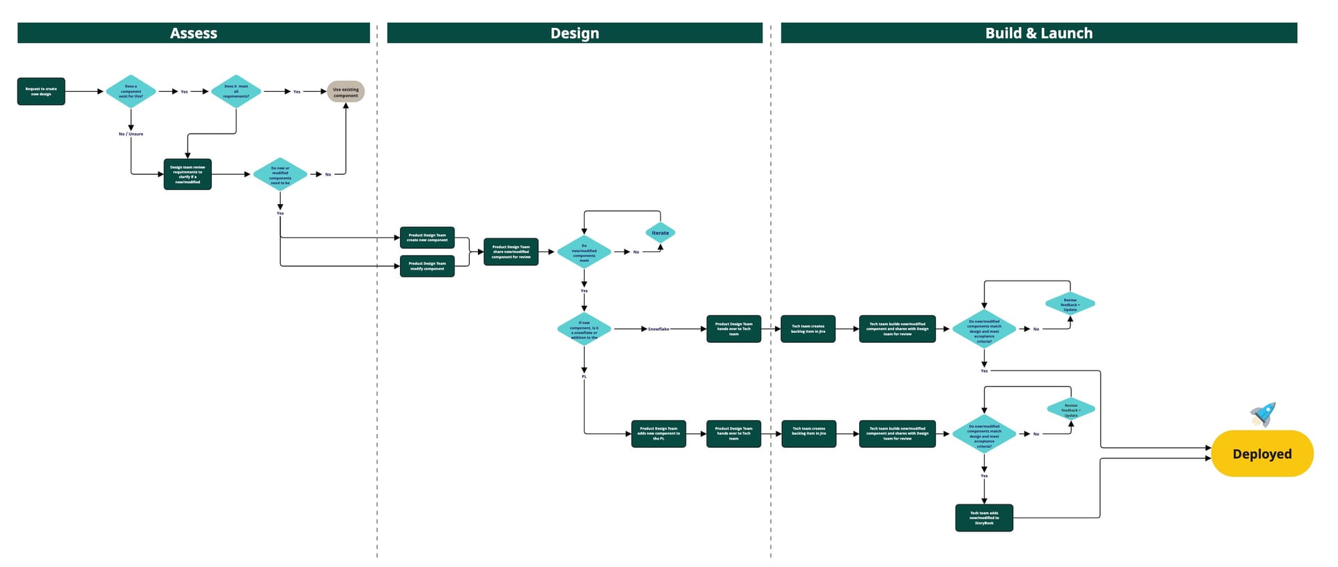
Not surprisingly, there’s no cookie-cutter approach to defining a decision flow chart for your Pattern Library, it is something that needs to be co-created between design and engineering team members to leverage their established ways of working, toolsets and channels.
There are a few key areas to discuss as a team when defining your decision flow chart:
- How do designers avoid duplication?
- What’s the process for assessing whether to modify an existing pattern?
- What’s the process for assessing whether to create a new pattern?
- What’s the process for assessing whether a new pattern is reusable or a Snowflake?
- Where do Design and Engineering practitioners come together to review updates?
- What’s the process for merging new/updated patterns to the Library?
To ensure that these points are being considered by the team, you might begin with a relatively simple checklist format which you can grow organically into a more detailed decision flow as you learn more about what works for your team and their Pattern Library in regards to governance.
Where to track Pattern Library changes
We recommend keeping track of changes to your Pattern Library, especially when it grows in complexity and in terms of the teams/projects using it. If you’ve ever used Abstract for Sketch, Figma versioning or branching, or even Git, you know how useful documenting changes is when it comes to troubleshooting and workflows. If you also manage a backlog of the incoming changes, you’ve not just solved task management, you’ve now got redundancy in your documentation.
For sufficient tracking, we suggest the following as a baseline:
- Create a dedicated DesignOps kanban board to keep track of any tasks related to updates to the design toolkits used by teams. Make sure to discuss with your team about where to house the front end development ticket, once updates are ready to be implemented.
- Always publish Library changes (in Slack, Teams, etc.) with clear release notes detailing what was done.
- Create a dedicated Pattern Library channel in your comms tool (Slack, Teams, etc.), and consider using integrations to automate updates to this channel. For example, Figma has a Slack app that automatically updates selected Slack channels when new versions of your Library are published.
How to track Pattern Library changes
It’s helpful for your cross-functional team to align on a method for version control of their Library, to ensure consistency between design and front end tools. A common approach is to follow the SemVer method for versioning Libraries, where version numbers take the form X.Y.Z, with each number representing the impact of the version change. Here are some examples of how to use semantic versioning for a user interface Design System:
Major (X) Major versions (e.g. 2.0.0 to 3.0.0) are updated when there are significant changes to the Library that may require significant rework by designers and developers, alongside updates to existing, released UX flows. Examples of changes that may warrant a major version update include:
- Significant visual changes or updates to existing components.
- Significant changes or updates to existing global styles.
- Significant changes to the structure and taxonomy of the Library.
Minor (Y) Minor versions (e.g. 2.0.0 to 2.1.0) are updated when there are new additions or improvements to the Library that do not require significant rework by designers and developers. Examples of changes that may warrant a minor version update include:
- Merging new components to the Library.
- Minor improvements to existing components.
- Adding new global styles to the Library, which do not affect existing, released UX flows.
Patch (Z) Patch versions (e.g. 2.0.0 to 2.0.1) are for bug fixes and minor updates to the Library that do not require any significant changes to the design or development process. Examples of changes that may warrant a patch version update include:
- Bug fixes for patterns.
- Small visual updates to improve UI consistency.
- Changes to the Design System's documentation.
If you’re unsure of the impact of an update to your Library, the best thing to do is to discuss with your cross-functional team to decide on an appropriate version change.
Final thoughts
Creating a Pattern Library is a complex task that requires a lot of talented people working together, across disciplines to build something that's right for their organisation.
As mentioned earlier on in this guide, there's no cookie-cutter solution that works for every organisation, but the guidance and tools we've pulled together in this Playbook are intended to offer any team a solid starting point to begin their Pattern Library journey.
If you'd like to discuss starting (or stepping-up) your Pattern Library journey, contact us at co-create@futurice.co.uk.
We've created an open Miro board for you to get started - follow this link and let us know what you think.
 Thomas WeaverDesign Director, UK