Business forecasting with Facebook Prophet
In this blog post you are going to learn how to do solid time-series analysis and forecasts with the Facebook Prophet library.
Forecasting with time series models can be used by businesses for many purposes, for example, to optimise sales, improve supply chain planning and perform anomaly detection, to mention a few. There is also a multitude of techniques you can use, from naive extrapolation of historical data to more sophisticated machine learning models. Some of the advanced techniques put considerable requirements on both the data, implementor and analysts, often making it hard to come up with stable performing forecast models. The nice thing about the Prophet library is that it is quite forgiving, meaning that it produces reasonable results out of the box. That said, Prophet is best suited for business-like time series with clear seasonality and where you know important business dates and events beforehand. It’s also, like with most time series tools, good to have a data set with observations that span a few years.
Lastly, Prophet is also quite easy to tune with its understandable hyper-parameters. In addition, it is extendable, so if you need to add additional regressors, seasonalities or special events you can do so easily.
The problem to solve
Imagine that we work as data analysts at a bike rental start-up, let’s call it Acme Bikes, and we have gathered some data measuring people using their bikes to and from work. In addition, the dataset is augmented with historical rainfall and temperature data. We are asked to provide some insights into the dataset and provide a forecast model to estimate future commutes at any given time horizon. We are also asked to provide some indication of validity in the form of statistical tests. Are we up for it? But of course.
Introduction to Prophet — the main concepts
Prophet takes a novel approach and sees forecasting mainly as a curve fitting exercise using probabilistic techniques and inspiration from generalised additive models. We will not dive into the mathematical details in this article but for those inclined, I suggest reading the original Prophet paper.
The Prophet library is especially useful for business time series with clear seasonality and the knowledge of special events that have high impact on the data, for example, national holidays, Black Friday, the introduction of a new product, promotional campaigns and so on. To model time series Prophet separate the signal into the following additive components:
 Prophet components
Where:
g(t) is the trend function which models non-periodic changes using either a non linear saturation growth model or piecewise linear regression model. You can configure this using parameters.
s(t) is the seasonal functional (yearly, weekly and daily) which models the periodic changes in the value of the time series. This component is modelled using a Fourier transform and if you want you can add your own seasonalities.
h(t) represents the function for modelling holidays and special impact events. You can add your own set of custom holidays and special events.
εt is the models error/noise which is assumed being normal distributed
I think this approach is an intuitive and novel one and it’s easy for analysts to get a conceptual understanding of what makes up the predictions. Later on we are going to verify that the model actually works the way as described mathematically. If you’re interested in the mathematics and theory behind Prophet you can read their paper which nicely describes the rationale behind building the library in addition to diving deeper into the different components of the model. Enough talk, let’s get started!
A short note on the data
For this imaginary example, I’ve made a dataset by combining real world data from the Norwegian road authorities and the Norwegian Meteorological Institute. More specifically the data is counting bike commuters on a specific stretch in Oslo, Norway at Ullevål. You can download the data her: https://github.com/pixelbakker/datasets/blob/master/bikerides_day.csv
The plan
Before we start working we make a brief work breakdown as follows:
- Visually inspect the data and control for missing data and outliers
- If needed, transform the data
- Make a first prediction model without any tuning and validate the model.
- Tune and test the model with the addition of special events and dates
- Tune and test the model with rainfall and temperature as additional regressors.
- Tuning hyperparameters
A first look at the data
For brevity, I’ve chosen to provide a cleaned dataset so that we can spend most of our time with actual analysis and not sorting out bad data.
import pandas as pd
import numpy as np
import itertools
%matplotlib inline
import matplotlib.pyplot as plt
import numpy as np
import plotly.offline as pyoff
import plotly.graph_objs as go
from sklearn import preprocessing
from fbprophet import Prophet
from fbprophet.plot import add_changepoints_to_plot
from fbprophet.diagnostics import cross_validation
from fbprophet.diagnostics import performance_metrics
from fbprophet.plot import plot_cross_validation_metric
from scipy.stats import boxcox
from scipy.special import inv_boxcox
pd.set_option('display.max_row', 1000)
# Read the data
# NOTE: You must change the path to reflect your environment
bikerides = pd.read_csv('/content/drive/My Drive/blog/timeseries/bikerides_day.csv', error_bad_lines=False, encoding= 'unicode_escape', delimiter=',')
# Convert Date to datetime
bikerides['Date'] = pd.to_datetime(bikerides['Date'])
bikerides.head(5)```
*Import libraries and read the data and convert the date column*
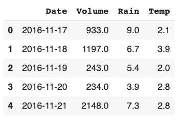
*Listing 1: Our data raw frame*
Prophet is expecting columns to have specific names, ```ds``` for the temporal part and ```y``` for the value part. So we adhere to that.
Rename the columns to Prophet scheme who expect date column to be named "ds" and data column to called "y"
bikerides.columns = ['ds', 'y', 'rain', 'temp'] bikerides.head(1) ```
It’s always a good idea to plot the data to get a first impression on what we are dealing with. I use plot.ly for custom charts — it’s good.
fig = go.Figure()
#Create and style traces
fig.add_trace(go.Scatter(x=bikerides['ds'], y=bikerides['y'], name='Rides',))
fig.show()```
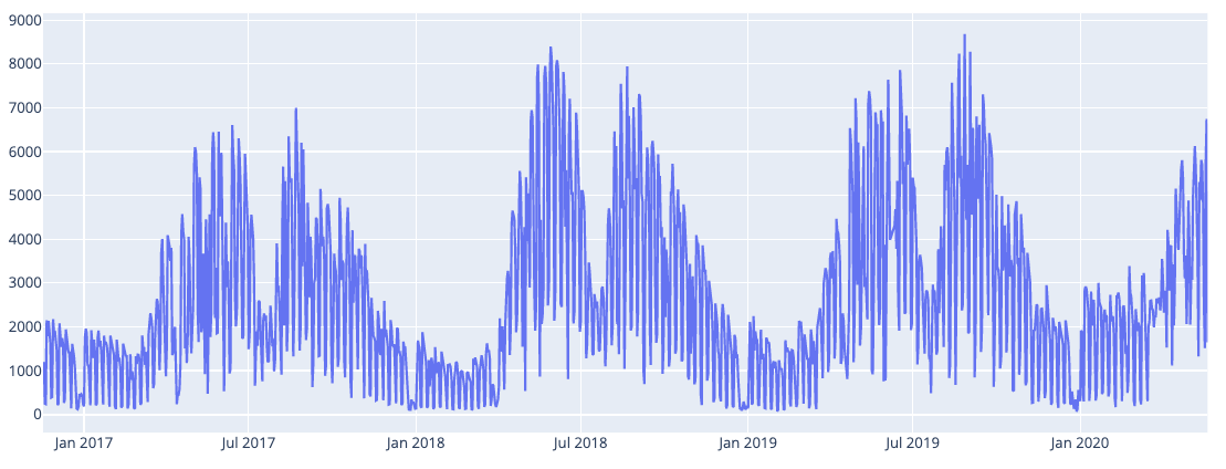
*Fig 1. Raw plot of our data*
### __Removing weekend rides__
We can see that the data has clear seasonality and maybe a slight positive trend although that is harder to see. We can also notice quite a lot of variability. Some of the variability is probably caused by weekends when people are not commuting to work. Let’s remove all the weekends from our data and see how it looks.
Removing weekends
bikerides.set_index('ds', inplace=True) bikerides = bikerides[bikerides.index.dayofweek < 5].reset_index() #Plot fig = go.Figure() #Create and style traces fig.add_trace(go.Scatter(x=bikerides['ds'], y=bikerides['y'], name='Rides',)) fig.show()```
 Fig 2: Data without weekend commutes
Still some variability but considerable less. Hopefully much of the remaining variability can be explained by seasonality, holidays and our additional weather regressors: rain and temperature. We’ll see shortly.
Applying Box Cox transformation
For time-series it’s often useful to do some form of power transform of the data to stabilise variance and make the data more normal distribution-like. But what transformation to use for the best result? Fortunately, we can use a Box Cox transformation that evaluates a set of lambda coefficients (λ) and selects the value that achieves the best approximation of normality. We can do it like so:
# Apply Box-Cox Transform and save the lambda for later inverse.
bikerides['y'], lam = boxcox(bikerides['y'])
print('Lambda is:', lam)```
*Applying the Box Cox transformation.*
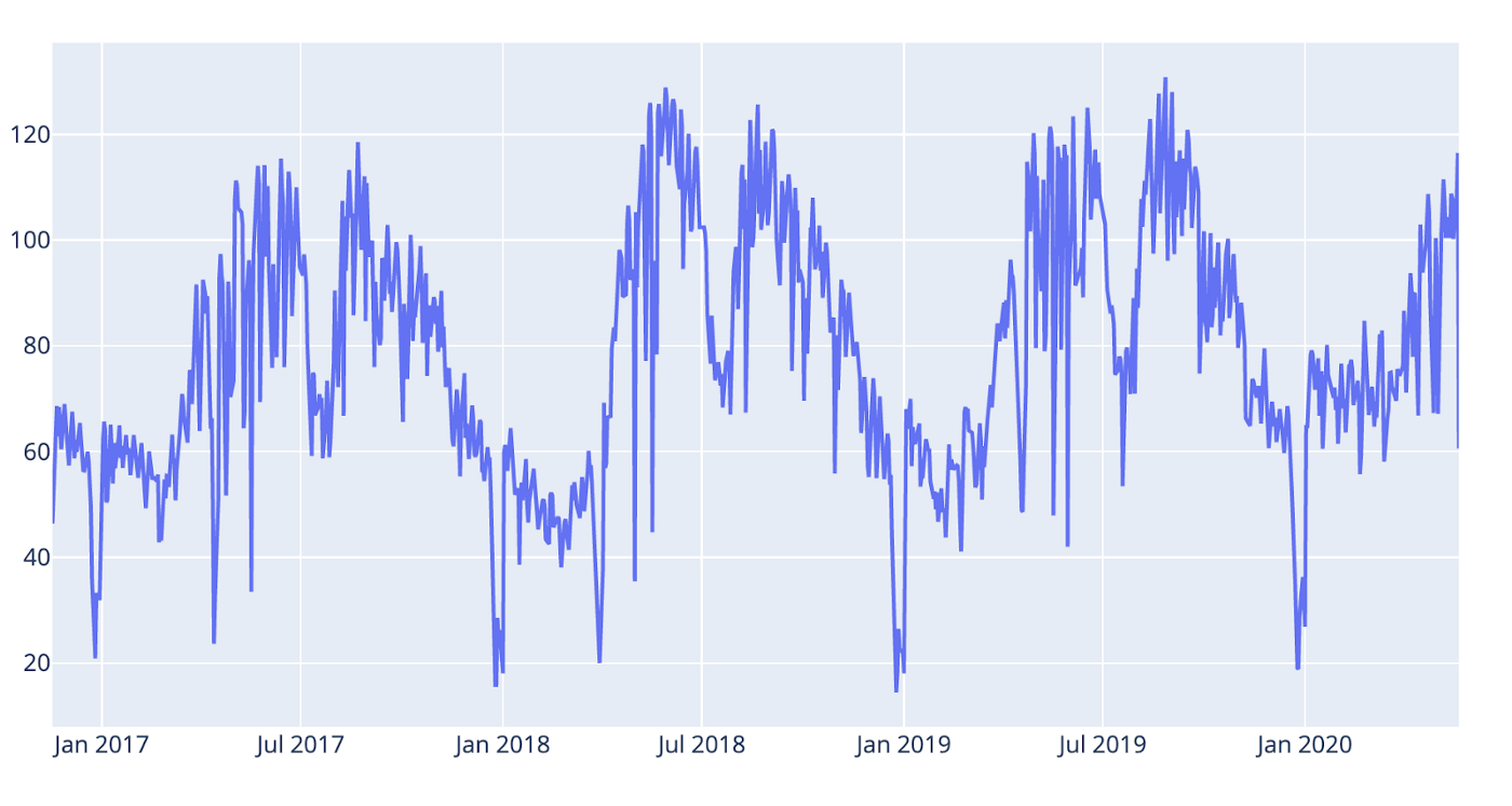
*Fig 3: After Box Cox transformation.*
We can se that the variance is less now, especially around the seasonal peaks.
### __Plotting the weather data__
When we’re into plotting let’s have a look at the rain and temperature data as well. Before we plot we normalise the data so we get comparable scales.
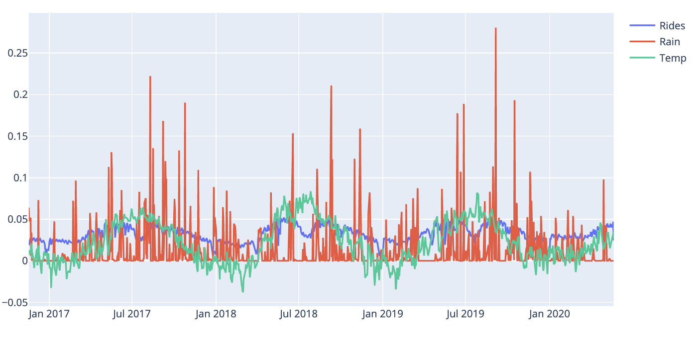
*Fig 4: Rides and weather data*
Not surprisingly, the temperature is highly correlated to the commute volume. We see a break in the pattern in July most likely due to the Norwegian common holiday. When it comes to the rain it’s harder to draw any conclusions from the plot but when zooming in there are signs that rain might play a role. We’ll see.
Ok, it looks like we are ready to go. Let’s do some forecasting.
### __Forecasting with prophet — a first take__
The Prophet code flow is really simple: First get hold of a Prophet instance and fit a model with our bike rides data frame. Then we create a data frame holding the prediction dates (horizon) and pass that into the Prophet predict method, like so:
Get hold of the Prophet object
m = Prophet()
Fit the data. Remember that prophet expect "ds" and "y" as names for the columns.
m.fit(bikerides)
We must create a data frame holding dates for our forecast. The periods # parameter counts days as long as the frequency is 'D' for the day. Let's # do a 180 day forecast, approximately half a year.
future = m.make_future_dataframe(periods=180, freq='D')
Create the forecast object which will hold all of the resulting data from the forecast.
forecast = m.predict(future)
List the predicted values with a lower and upper band.```
When listing the forecast data-frame we get:
 Listing 2: First forecast data frame
The yhat-column contains the predictions and then you have lower and upper bands of the predictions. Although the forecast data frame contains all the data you need to make your own plots, Prophet also provides convenience methods for plotting. For brevity, we are going to use the built-in methods where we can, but when needed, we’ll make our own custom plots with plotly. Plotting our forecast with Prophet can be done like so:
# Plotting with Prophet built-in method
fig = m.plot(forecast)
ax = fig.add_subplot(111)
ax.axvline(x=forecast['ds'].max() - pd.Timedelta('180 days'), c='red', lw=2, alpha=0.5, ls='--')
fig.show()```
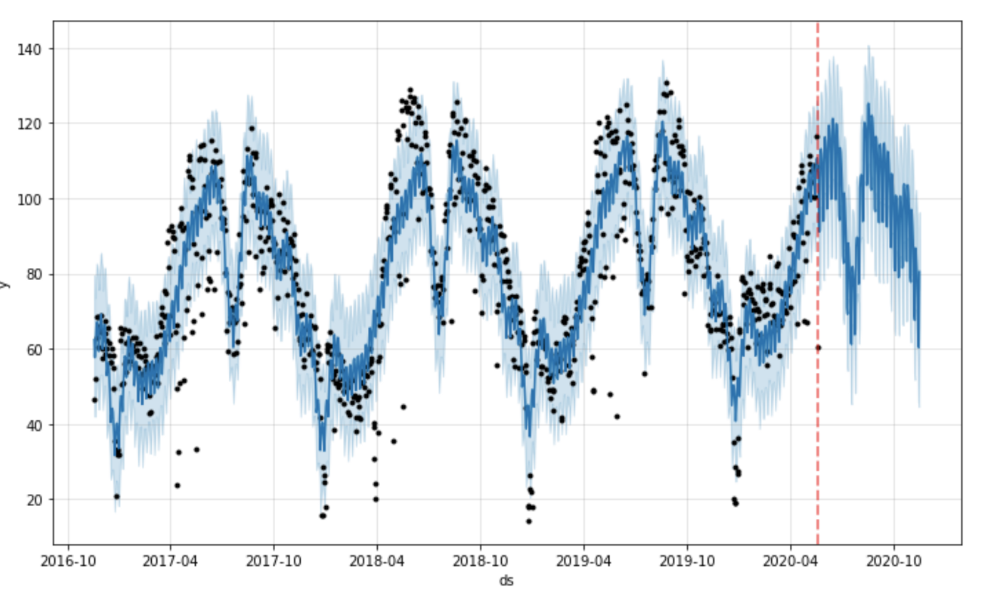
*Fig 5: Forecast plot with Prophet built-in method*
You can also add change-points (where the trend model is shifting) to the plot like this:
fig = m.plot(forecast) a = add_changepoints_to_plot(fig.gca(), m, forecast)```
 Fig 6: Forecast with change-points
This Prophet plot does not contain all the change points, only the most important ones. If you want to view all of them you could use the following code:
# Listing all the change points in the model
deltas = m.params['delta'].mean(0)
cp = pd.DataFrame(m.changepoints)
cp['deltas'] = deltas
fig = go.Figure()
# Create and style traces
fig.add_trace(go.Bar(x=cp['ds'], y=cp['deltas'], name='CPs',))```
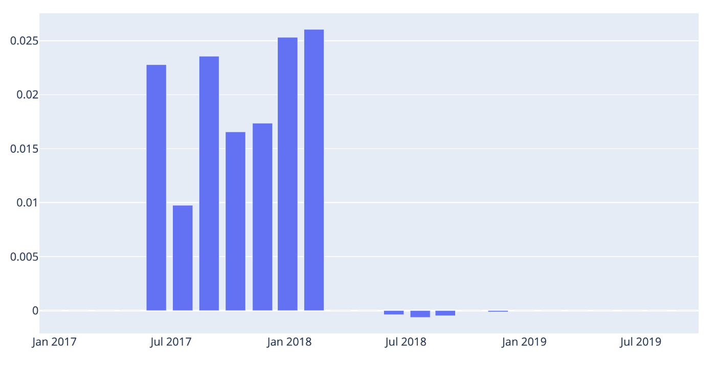
*Fig 7: All the models change points.*
If we want we can also plot all the components that make up the model: trend, different seasonalities and holidays — we’ll cover that in more detail later on. For now let’s just look at the components using the built-in plotting method.
fig = m.plot_components(forecast)```
Which gives the following output:
 Fig 8: The model components so far.
We can see that we have a clear positive trend and that Monday and Tuesday are the days when most people commute. We also see a strong yearly seasonality.
Validating our results
Cross validation
In order for us to find out how our model performs and know if we are making progress we need some form of validation. We could, of course, write our own validation code, but fortunately we don’t have to, because Prophet provides most of what we need.
The Prophet library makes it possible to divide our historical data into training data and testing data for cross validation. The main concepts for cross validation with Prophet are:
- Training data (initial): The amount of data set aside for training. The parameter is in the API called initial.
- Horizon: The data set aside for validation. If you don’t define a period the model will be fitted with Horizon/2.
- Cutoff (period): a forecast is made for every observed point between cutoff and cutoff + horizon.
The resulting data frame can now be used to compute error measures of yhat vs. y. Below I’ve plotted a chart with some markers to help you understand in a more visual way. In this example, we have a one year horizon and the model will make predictions for each month (~31 days).
# Fit the model with two years of data and define a horizon of 365 days forcasting per month
df_cv = cross_validation(m, initial='730 days', period = '31 days', horizon = '365 days')
cutoffs = df_cv.groupby('cutoff').mean().reset_index()['cutoff']
cutoff = df_cv['cutoff'].unique()[0]
df_cv = df_cv[df_cv['cutoff'].values == cutoff]
fig = plt.figure(facecolor='w', figsize=(10, 6))
ax = fig.add_subplot(111)
ax.plot(m.history['ds'].values, m.history['y'], 'k.')
ax.plot(df_cv['ds'].values, df_cv['yhat'], ls='-', c='#0072B2')
ax.fill_between(df_cv['ds'].values, df_cv['yhat_lower'],
df_cv['yhat_upper'], color='#0072B2',
alpha=0.2)
#ax.axvline(x=pd.to_datetime(cutoff), c='gray', lw=4, alpha=0.5)
ax.set_ylabel('y')
ax.set_xlabel('ds')
# Making all the vlines for cutoffs
for item in cutoffs:
ax.axvline(x=pd.to_datetime(item), c='red', lw=2, alpha=0.5, ls='--')
# Adding text to describe the data set splits
ax.text(x=pd.to_datetime('2017-07-07'),y=12, s='Initial training data', color='black',
fontsize=16, fontweight='bold', alpha=0.8)
ax.text(x=pd.to_datetime('2018-12-17'),y=24, s='Cutoffs', color='black',
fontsize=16, fontweight='bold', alpha=0.8)
ax.text(x=pd.to_datetime(cutoff) + pd.Timedelta('180 days'),y=24, s='Horizon', color='black',
fontsize=16, fontweight='bold', alpha=0.8)
ax.axvline(x=pd.to_datetime(cutoff) + pd.Timedelta('365 days'), c='gray', lw=4,
alpha=0.5, ls='--')```
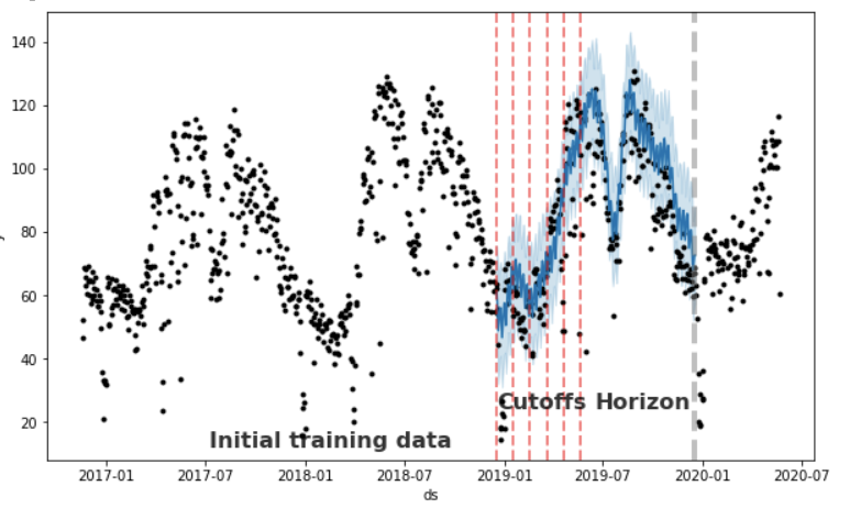
*Fig 9: Showing training, cutoff and horizon periods*
### __Getting the performance metrics__
So we have now made our first forecast with the Prophet library. But how do we know if the results are any good? Fortunately, Prophet comes with some built-in performance metrics that can help us out. I’m not going into the details when it comes to which metrics to use and leave that up to you. The performance metrics available are:
- __Mse__: mean absolute error
- __Rmse__: mean squared error
- __Mae__: Mean average error
- __Mape__: Mean average percentage error
- __Mdape__: Median average percentage error
The code for validating and gathering performance metrics is shown below. First you need to get the cross validation data (we already did that in the above code listing, it’s the data frame called ```cv_df``` )Then we put the cross validation data frame into the Prophet method ```perfomance_metrics```, like so:
df_p = performance_metrics(df_cv) df_p.head(5)```
Listing the performance data frame gives us the following:
 Listing 3: Performance metrics per day up to horizon.
To see how our model performs over time up to the horizon we can use the built-in plot called plot_cross_validation_metric , like this:
plot_cross_validation_metric(df_cv, metric='mape')```
Which gives the following plot:
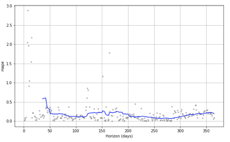
*Fig 10: Viewing the cross validation visually over time*
We see that we got forecasts for each day up to the horizon. At the beginning, we see that the *mean average percentage error* (mape) is considerable but it also goes down considerably after a few days. Hopefully we can make this plot more performant as we start tuning our model.
As we proceed we want to compare our validation results, so I’ve chosen to make a spreadsheet on the side in which to store the intermediate results. Also, since we use transformed numbers (remember the Box Cox) we just use the percentage error metrics. To keep track, we collect the mean aggregated data from our cross validation like this:
df_p.mean()```
Which gives a listing like this:
 Listing 4: The mean of the cross validation data
After our first run the results spreadsheet looks like this:
 Fig 11: The results spreadsheet after the first run
Before moving on to improve our forecast model we’ll add two utility functions so we don’t need to change data all over the place if we want to test different cross validation set-ups. They look like this:
def getPerfomanceMetrics(m):
  return performance_metrics(getCrossValidationData(m))

def getCrossValidationData(m):
 return cross_validation(m, initial='730 days', period = '31 days', horizon = '365 days')```

## __Improving our forecast__
### __Adding holidays__
Prophet has several ways of adding holidays and special events. The easiest and most convenient one is to use the built-in national holidays. The holidays for each country are provided by the holidays package in Python. A list of available countries, and the country name to use, is available on their page: https://github.com/dr-prodigy/python-holidays. We need Norwegian holidays so we do it like this:
m = Prophet() m.add_country_holidays(country_name='NO') m.fit(bikerides)
List the holiday names
m.train_holiday_names```
The last line of code lists all the built-in holidays and from the looks of it, the listing seems to be correct, although it could be augmented with dates for Christmas Eve or New Years eve and maybe others — but it’s a start. If we want to see the forecast and the effects made by the holidays regressors we can plot it like this:
fig = go.Figure()
# Create and style traces
fig.add_trace(go.Scatter(x=bikerides['ds'], y=bikerides['y'], name='Actual',))
fig.add_trace(go.Scatter(x=forecast['ds'], y=forecast['yhat'], name='Predicted',))
fig.add_trace(go.Scatter(x=forecast['ds'], y=forecast['holidays'], name='Holidays',))
fig.show()```
And the plot looks like this:
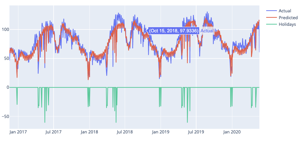
*Fig 12: Plot with holiday effects*
If we look at the cross validation data we can see that the model fits both May 1 and 17 very well but Ascension Day on May 30 2018, not so much. In addition Ascension Day in 2018 is on a Thursday and that tends to make people take Friday off in Norway. We can see this in the plot if we zoom in.
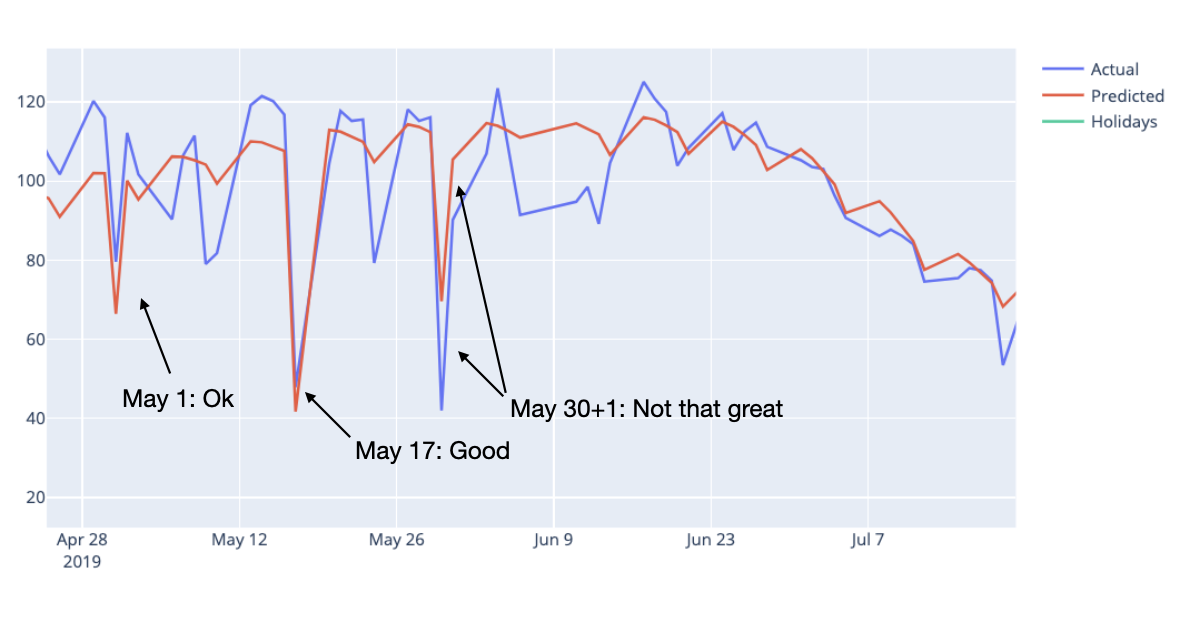
*Fig 13. Zoomed in on dates in May*
We are not particularly impressed with the Christmas model fits either. If we zoom in on the plot for 2019 we can see this:
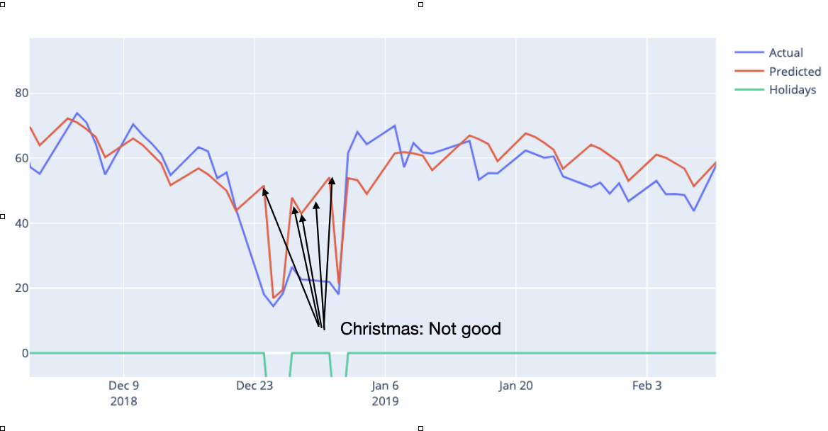
*Fig 14: Bad forecasts at Christmas 2019*
Fortunately Prophet gives us the opportunity to add our own holidays and special dates. To see if we get an improved forecast we’ll add some additional dates for the model to take into account. Like so:
ascensionday = pd.DataFrame({ 'holiday': 'AscensionDay', 'ds': pd.to_datetime(['2019-05-30']), 'lower_window': 0, 'upper_window': 1, })
christmas = pd.DataFrame({ 'holiday': 'Christmas', 'ds': pd.to_datetime(['2017-12-24','2018-12-24','2019-12-24','2020-12-24']), 'lower_window': -1, 'upper_window': 7, })
holidays = pd.concat((ascensionday, christmas))
m = Prophet(holidays=holidays) m.add_country_holidays(country_name='NO') m.fit(bikerides) future = m.make_future_dataframe(periods=0, freq='D') forecast = m.predict(future)
fig = go.Figure()
Create and style traces
fig.add_trace(go.Scatter(x=bikerides['ds'], y=bikerides['y'], name='Actual',)) fig.add_trace(go.Scatter(x=forecast['ds'], y=forecast['yhat'], name='Predicted',)) fig.add_trace(go.Scatter(x=forecast['ds'], y=forecast['holidays'], name='Holidays',)) fig.show()```
For the Ascension Day date I’ve set the upper_window. This means that the effect of the day will spill over by one day so that we can capture the effect on Friday also. For the Christmas dates I’ve set the lower window so that we can catch the day before Christmas Eve in Norway and the upper window to catch the whole Christmas vacation that many Norwegians have. We can now fit a new model and add the new holiday effects.
The new plots show impressive improvements. Below you can see the plot for Christmas 2019 which now has been perfectly fitted.
 Fig 15: Christmas fitted perfectly
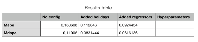
We leave the holidays for now, but before we move on, let’s gather some performance data and update our performance table:
getPerformanceMetrics(m).mean()```
*Listing 5: Updated performance table*
As we can see the holiday tuning has a significant forecast effect. Now, let’s add some extra regressors.
### __Adding extra regressors__
If we look at the plot it doesn’t look half bad but can we improve our forecast? Remember we had some extra weather data? Let’s see if adding those as extra regressors will have any effect. Adding extra regressors is pretty straightforward but remember if you are going to use some in your forecast model you need to have the data present beforehand. With weather data this can be accomplished with weather forecasts. IMHO, the easiest and most solid extra regressors you can use are holidays and special dates that you know about, so I encourage you to do some extra work on those. But back to the weather data. We can add the rain and temperature data as extra regressors to the model like this (note that it’s only two code lines that change but I leave the whole listing for easy execution):
m = Prophet(holidays=holidays) m.add_country_holidays(country_name='NO')
Adding the extra weather regressors
m.add_regressor('rain') m.add_regressor('temp')
m.fit(bikerides) future = m.make_future_dataframe(periods=0, freq='D') future = future.merge(bikerides, on='ds') forecast = m.predict(future) fig = go.Figure()
Create and style traces
fig.add_trace(go.Scatter(x=bikerides['ds'], y=bikerides['y'], name='Actual',)) fig.add_trace(go.Scatter(x=forecast['ds'], y=forecast['yhat'], name='Predicted',)) fig.add_trace(go.Scatter(x=forecast['ds'], y=forecast['rain'], name='Rain',)) fig.add_trace(go.Scatter(x=forecast['ds'], y=forecast['temp'], name='Temp',)) fig.show()```
 Fig 16: Plot with extra regressors rain and temperature
Looking at the plot it’s obvious that both rain and temperature are having an impact on the forecast. Let’s gather the performance data and update our performance table:
getPerformanceMetrics(m).mean()```
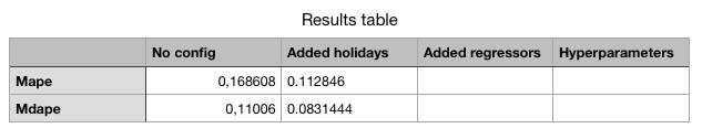
It starting to look like something! Our mean average percentage error is now below 10%.
*Listing 6. Updated results table*
### __Tuning hyperparameters__
Prophet has quite a few parameters for you to tune. I’m not going to delve into the details of all of them but below you can see code that you can use for testing different hyper-parameters in a loop and then pick the best ones. Remember that if you choose to test all of the parameters in one go the number of permutations will be many and the running time will be considerable. I chose to tune one parameter at a time and I left the parameter arrays that I started with in the comments for you to try out yourself.
def create_param_combinations(**param_dict): param_iter = itertools.product(*param_dict.values()) params =[] for param in param_iter: params.append(param) params_df = pd.DataFrame(params, columns=list(param_dict.keys())) return params_df
def single_cv_run(history_df, metrics, param_dict, parallel): m = Prophet(holidays=holidays, **param_dict) m.add_country_holidays(country_name='NO') # Adding the extra weather regressors m.add_regressor('rain') m.add_regressor('temp') m.fit(history_df) df_cv = getCrossValidationData(m) df_p = performance_metrics(df_cv, rolling_window=1) df_p['params'] = str(param_dict) df_p = df_p.loc[:, metrics] return df_p
#'changepoint_range': [0.6, 0.7, 0.75, 0.8, 0.9], #'changepoint_prior_scale': [0.01, 0.05, 0.1, 0.25, 0.5], #'seasonality_prior_scale':[0.5, 1.0, 2.5, 5], #'holidays_prior_scale':[1.0, 5.0, 10.0, 15.0], #'yearly_seasonality':[5, 10, 15, 20], #'weekly_seasonality':[5, 10, 15, 20], pd.set_option('display.max_colwidth', None) param_grid = {'changepoint_prior_scale': [0.01], 'changepoint_range': [0.3], 'holidays_prior_scale':[1.0], 'seasonality_prior_scale':[0.5], 'yearly_seasonality':[20], 'weekly_seasonality':[5], } metrics = ['horizon', 'rmse', 'mae', 'mape', 'mdape','params'] results = []
#Prophet(,) params_df = create_param_combinations(**param_grid) for param in params_df.values: param_dict = dict(zip(params_df.keys(), param)) cv_df = single_cv_run(bikerides, metrics, param_dict, parallel="processes") results.append(cv_df) results_df = pd.concat(results).reset_index(drop=True) best_param = results_df.loc[results_df['rmse'] == min(results_df['rmse']), ['params']] print(f'\n The best param combination is {best_param.values[0][0]}') results_df.mean()```
To see if the tuning have any effect we fit a new mode with our new parameters set, like this:
m = Prophet(holidays=holidays, changepoint_prior_scale=0.01,
changepoint_range=0.8,
seasonality_prior_scale=0.5,
holidays_prior_scale=1.0,
yearly_seasonality=20,
weekly_seasonality=5,
seasonality_mode='additive')
m.add_country_holidays(country_name='NO')
# Adding the extra weather regressors
m.add_regressor('rain')
m.add_regressor('temp')
m.fit(bikerides)
getPerfomanceMetrics(m).mean()```
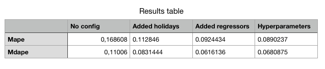
*Listing 7: Updated results table*
We see that we get some improvement on the mape metric, although not that much. From other time-series analysed I’ve seen better results so I guess it’s always worth trying out.
### __Plotting and verifying the whole model__
Remember that in the beginning, we listed the mathematical formula that said that our forecast was the sum of the model components for trend, seasonality, holidays and so on. We can actually check that this is true. Let’s first start by plotting all of the components.
fig = go.Figure()
Create and style traces
fig.add_trace(go.Scatter(x=bikerides['ds'], y=bikerides['y'], name='Actual',)) fig.add_trace(go.Scatter(x=forecast['ds'], y=forecast['yhat'], name='Prediction',)) fig.add_trace(go.Scatter(x=forecast['ds'], y=forecast['trend'], name='Trend',)) fig.add_trace(go.Scatter(x=forecast['ds'], y=forecast['rain'], name='Rain',)) fig.add_trace(go.Scatter(x=forecast['ds'], y=forecast['temp'], name='Temp',)) fig.add_trace(go.Scatter(x=forecast['ds'], y=forecast['yearly'], name='Yearly',)) fig.add_trace(go.Scatter(x=forecast['ds'], y=forecast['holidays'], name='Holidays',)) fig.add_trace(go.Scatter(x=forecast['ds'], y=forecast['weekly'], name='Weekly',)) fig.show()```
Resulting in this plot:
 Fig 17: Listing all the components in the model
Plotly does a fantastic job charting, and you can toggle the viewing of the different components by clicking on the legend labels on the right for better readability.
To check that the model's forecast is actually the sum of its components we can run the following snippet:
# Let's get the sum of yhat (the prediction)
sum_yhat = forecast['yhat'].sum()
print('Forecast sum is:', sum_yhat)
sum_components = forecast['trend'].sum()+forecast['yearly'].sum()+ forecast['weekly'].sum()+forecast['holidays'].sum()+ forecast['extra_regressors_additive'].sum()
print('Sum of components is:', sum_components)
print('The model is equal to the sum of its components:', sum_yhat.round()==sum_components.round())```
And gets the confirmation like so:
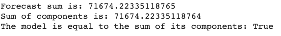
*Listing 8: Confirming that the model is the sum of its parts*
### __Making an actual forecast__
So, we’re done for now. The last thing we want to do is to make an actual forecast. Remember that we must take the inverse of our Box Cox transformed numbers also and this is how you do it:
Make a zero days forecast just for plotting
future = m.make_future_dataframe(periods=0, freq='D') future = future.merge(bikerides, on='ds') forecast = m.predict(future)
Transform back to reality from Box Cox
forecast[['yhat','yhat_upper','yhat_lower']] = forecast[['yhat','yhat_upper','yhat_lower']].apply(lambda x: inv_boxcox(x, lam)) bikerides['y'] = inv_boxcox(bikerides['y'], lam)
Plot the results
fig = go.Figure() fig.add_trace(go.Scatter(x=bikerides['ds'], y=bikerides['y'], name='Actual',)) fig.add_trace(go.Scatter(x=forecast['ds'], y=forecast['yhat'], name='Predicted',)) fig.show()```
Confirming that the scales are back and usable in the real world.
 Fig 18: Plot with real world numbers.
Conclusion
In this article, you have learned how to use the Facebook Prophet library to make time series forecasts. We have learned how to use Box Cox transformation and how to add extra regressors and tune Prophet models to perform increasingly better. We started out with a mean percentage average error of ~17% and ended up with ~9%, a considerable improvement and a usable result. I hope this article was valuable to you and that you learned something that you can use in your own work.
- Facebook prophet in a nutshell
- What is Facebook prophet?
- Prophet is a procedure for forecasting time series data. Facebook prophet takes a novel approach and sees forecasting mainly as a curve fitting exercise using probabilistic techniques and inspiration from generalized additive models.
- Why is Facebook good?
- The Prophet library is especially useful for business time series with clear seasonality and the knowledge of special events that have high impact on the data, for example, national holidays or Black Friday. Time series models can be used by businesses for many purposes.
- How to use Facebook prophet?
- Facebook prophet library has a multitude of techniques that can be used, from naive extrapolation of historical data to more sophisticated machine learning models. Some of advanced techniques put considerable requirements on both the data, implementor and analysts but generally Facebook prophet is quite forgiving and may produce reasonable results out of the box.
 Leif Arne BakkerBusiness Design Lead

