Being a designer is often about observing all things clever and beautiful. Even without conscious effort, all kinds of stuff gets stored somewhere in our neural network all the time. Scraps and details then bubble under without us even noticing it, gradually working their way out, to be born as something new. Suddenly a brilliant idea strikes you in a middle of a hot shower. Time freezes, soap runs into your eyes as you are trying to hold on to the thought.
For visually trained or skilled people, stepping out of the shower and doodling something quick and dirty to be processed into something more elaborate later on isn’t a problem. However, if you aren’t visually skilled by nature, it’s sometimes a struggle to visualize the idea.
It might take years to study the history, nuances and techniques of visual design. However there are a few basic rules of visual design that’ll guide you towards a coherent and understandable outcome. Whether it’s a powerpoint deck or a layout sketch you are doing, these basic guidelines will give you the building blocks for professional looking end result.
It’s all in our heads
It’s important to understand some of the basics of human psychology to comprehend how people most often see things and organise visual elements. We are all individuals and we interpret the world in different ways, but luckily there are some general similarities. So called Gestalt principles are used for explaining the most basic functions of human perception.
Rather than explaining the principles in this blog post, I’d suggest studying them from this article. Gestalt theories can be used as a validation tool for every design. Instead of scrutinising every single Gestalt principle one by one, try to learn them by heart and utilise them while crafting the design.
Elements of visual design that make all the difference
Balance
Balance in design is similar to balance in physics. A large shape close to the center can be balanced by a small shape close to the edge. A large light toned shape can be balanced by a small dark toned shape as the darker shape appears to be heavier.
Dominance
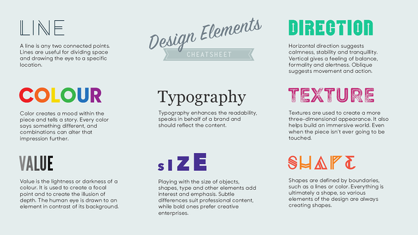
Elements in a composition will either appear equal or one will exert some level of dominance over the others. The dominant element will attract the eye and get noticed first. To control dominance and to set different visual weights, the basic design elements such as colour, value, size, direction and shape can be used to create the effect.
Hierarchy
Hierarchy is the order in which the elements within a composition are understood to be. The visual relation between elements creates logical order. Hierarchy can be built with placement, isolation and contrast. A single distinctive elements will most likely be perceived as being on top of the hierarchy.
Rhythm and continuation
Our senses easily recognise patterns and begin to expect changes according to them, like beats in music. Visual repetition increases predictability and helps the viewer to understand logical entities and order. A break in a rhythm also breaks the flow and draws attention. Visual breaks are effective in dividing content to sections. It can also be used to display divergent content without breaking the hierarchy.
Typography
To put it simply, typography is making words do their job of conveying information in the most efficient way possible.
Typography affects comprehension and perception - the process of understanding and perceiving information. It directs the reader’s focus. Sloppy typography consumes energy and time, a good one improves the reader’s efficiency. Typography also creates hierarchy by forming a visual route through the content.
Colour
Here comes the hard part. Colours are highly subjective. The concealed messages that colours have are often driven by personal taste, culture and context. However, there are a few basic rules to help you create a successful colour scheme.
Consider the target audience: always study both the demographics and the cultural environment.
Pick colours from source assets like logos, branding material and photographs identified with the theme.
Use shades and tints. Many successful colour schemes are made entirely with shades and tints of only one anchor colour.
Use complementary colours as focal points as the complementary scheme is intrinsically high-contrast and draws maximum attention. Be careful though, as complementary colours also create unwanted effects and eye sores when placed closely in full hue.
Examples of visual design with tips & tricks
Keep it simple
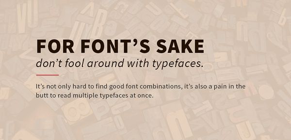
Stick to a simple collection of fonts. If you are unsure of good font combinations, create visual uniformity by applying only one font family to your design. Use a typeface or font family that has a selection of variants, such as italic, bold and condensed, to keep options open.
Make sure every element has a reason to be in the design and keep the number of fonts, colours and shapes to a minimum.
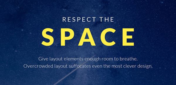
Give it room to breathe
Respect the space of other elements. Surround words with white space to let elements breathe. Space around text boxes, images and other graphic elements makes a design easier to comprehend. Use letter spacing to fill dead space, aligning text, or condense words that take up too much space.
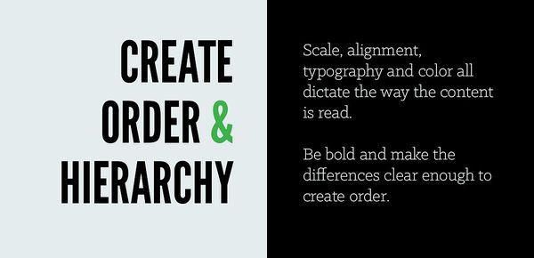
Make it coherent
Apply clear alignment to gain balanced and clear compositions. Use grids to place images and text. Horizontal and vertical lines are a great way to divide content, but remember that empty space also creates a line.
Apply colour or scale to create hierarchy. The most visually dominant feature in a design should be the most important part of the message.

Validate
Visual hierarchy can be tested out with a simple test. Take a look at your layout, squint your eyes and see if the visual hierarchy is still clear enough to understand.
Ensure that there’s enough contrast for good legibility. Crop background images so that there’s as much room for text as possible.

Be creative, borrow with pride
Gather ideas and inspirational details before you begin to create. The research process always gives fuel for the creative process.
Use inspirational materials and websites to find styles and effects you are after. Replicate the typography, the layout or the overall colour scheme and use it with your own content. But don’t stop there! Play around until the design looks like something you created.

Undo and try again!
Design is all about trial and error. Keep pushing the designs until you like what you see. The most used button of the design process is often ‘undo’.
Seeing is believing
Visualisation is the most effective way to communicate. The tricky part is to ensure that the message gets through as intended.
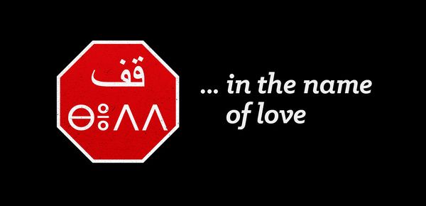
If the message is simple and the basic rules of design are used correctly, our brain will do the rest of the work. Think of a stop sign as an example. Even if you haven’t been sipping bad coffee in a driving school, you still probably understand the basic signal delivered. The colour says “Look at me, I’m important!”. The shape says “I’m here to tell you something different than the other signs”. And finally the text underlines the true meaning by shouting “Stop!”.
Good design should always aim to be self-explanatory, but that doesn’t stand a chance if the basics are wonky. As with the stop sign, some form of verbal communication is often needed to emphasize the message and to leave a memory trace. Once the trace is strong enough, the words aren’t needed anymore. Most of us know what that red hexagon on a pole means even without the word in the middle.
Follow the basic visual design rules and your chances of getting the message right multiply. A solid visual appearance not only helps you explain things, but also shares the burst of energy you had while having that shower.
- Quick facts on visual design
- What is visual design?
- Visual design is the practice of understanding the elements of balance, dominance, hierarchy, rhythm and continuation, typography and color and applying them in design. It might take years to study the history, nuances and techniques of visual design.
- What are some of basics of visual design?
- Few of the basic principle of visual design include simplicity - limiting the number fonts, colors and shapes - coherence and testing the visual hierarchies. It’s necessary to recognize that the visual design process is often about trial and error.
 Ville TervoLead UX/UI Designer

