Reinventing the Postcard with Data Portraits
Time for a creative challenge: How would you turn an ordinary postcard into an innovative and engaging experience? Through experimenting with data portraits I learned how data can enrich even such a simple form of communication, and untap previously unseen potential.
When was the last time you mailed someone a postcard?
If you’re anything like me, it’s probably been quite a while. But don’t we all love receiving postcards? Hand-picked by the sender, often with cheesy imagery on the front, but most importantly, with a handwritten note on the back. It’s a heartwarmingly personal feeling and – being stuck between social distancing and Zoom fatigue – one I seem to miss more than ever.
Background: Fighting Online Fatigue with Innovative Postcards
To navigate this physically distant time, we were looking for a quirky, personal way to engage with our local business contacts in Sweden. As most companies around us seemed to be competing over people’s attention during their screen time, we sensed that it might be a good time to go offline instead.
When the idea of sending out personal, handwritten notes on postcards eventually popped up, everything just clicked. Possibly related to the fact that Swedes seem to be secretly bonkers about postcards – at 14.5 million cards per year, Sweden is actually the biggest postcard producer in the EU, accounting for 24% of the total postcard production in Europe (Eurostat, 2021).
However, simply sending out plain, store-bought postcards did not feel right, and neither did sending out a brand-colored postcard with a simple logo print. We wanted this to be a more innovative, meaningful and personal experience, and at the same time, something that would combine our core competencies of data, design and technology. So we started experimenting with ideas that could make the postcard reflect the sender’s personality, or establish a stronger personal connection between sender and receiver overall. In the end, this led us to the concept of data portraits.
What Is a Data Portrait?
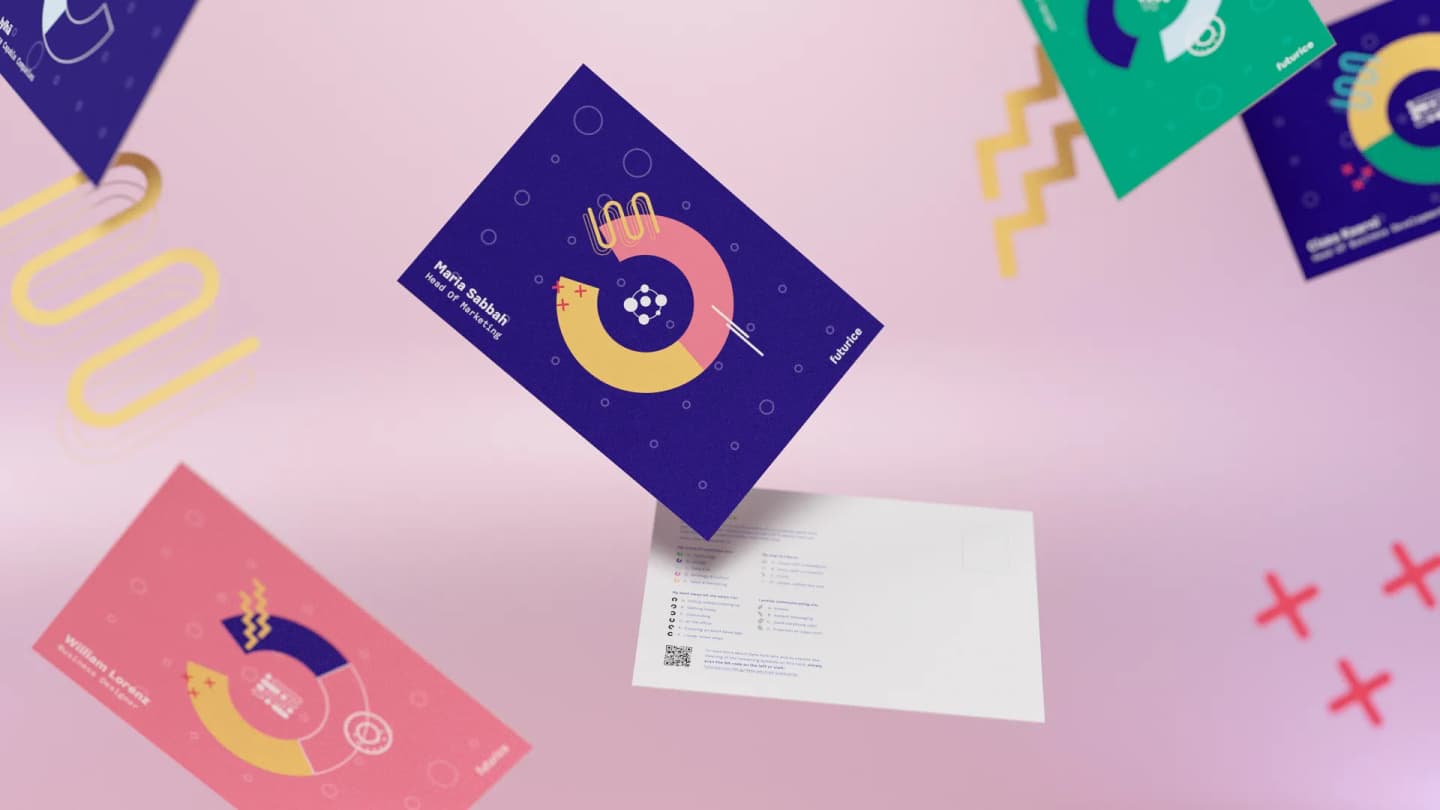
At its core, a data portrait is an artwork that depicts data accumulated about a person – rather than their face as seen in classical portraits (Donath et al., 2010). Our idea was to turn the motif featured on the front of the postcard into a data portrait of its sender.
This way, the cards would present the recipient with easily interpretable information about the sender that goes beyond their face. Besides its visual appeal, the design enables the recipient to discover unexpected facts about the sender and identify things they have in common with them. Not only a nice conversation starter the next time they’re in touch, but maybe the starting point for a stronger personal relationship between the two. Think of it as the data-enabled 21st century equivalent of personalized letterhead.
Transforming Postcards into Data Portraits
Collecting the Data
The foundation of our data portraits was set by defining the data the cards would eventually depict, and gathering that data. Our team came up with a questionnaire consisting of nine simple questions:
- My first name(s) are…
- My last name(s) are…
- My job title is…
- My areas of expertise are…
- My core talent at work is…
- My best ideas hit me when I’m…
- I prefer communicating via…
- My way to fika is…
- When space travel becomes a common thing to do, I would…
At this stage, we focused particularly on gathering information on the subject’s professional profile and ways of working. The actual data collection was done through a digital questionnaire where each sender would enter their answers in just a couple of minutes.
Translating Data into Visual Elements
In order to depict the responses in a comprehensible manner, we came up with an intriguing visual design that established graphical metaphors and analogies to represent the data. This ranged from transforming their name into a personal background pattern, to mimicking an analog clock that illustrates the subject’s most creative time of the day, or finding abstract shapes to reflect their favorite fika (Swedish coffee break) snack.
 Questionnaire with visual translation of its answers.
Getting the Job Done with Technology
Rather than creating each individual design manually, we wrote a custom piece of code to handle this part of the process for us. By using Processing, an open source software sketchbook, we were able to create, adjust and manipulate the graphic elements incorporated in a data portrait based on the individual responses.
In the end, creating data portraits for an entire team became as simple as moving a .CSV file with the questionnaire responses into a dedicated folder, and executing the code – conveniently leaving me time for a fika while my computer did all the heavy lifting of creating and exporting the final designs.
Putting it all together, this is how our data portraits turned out:
 Selected Data Portraits of our Stockholm team.
To get the postcards ready for printing, we added a brief explanatory design to go on the back of the cards before passing them onto our local Swedish printing partner Arkitektkopia. The physical cards – fresh off the press – were then distributed to our employees’ home offices. After adding a personal note, our Futuriceans simply needed to drop their cards into the nearest mailbox to get them on their way.
 Arkitektkopia cutting the printed postcards.
 Stacking the final Data Portrait postcards.
Our Learnings from Experimenting with Data Portraits
This little side project is a perfect example of how a design job can quickly grow into a journey that’s much larger than the sum of its parts. Over the course of this process, the seemingly simple task at hand unfolded into a much larger – and more meaningful – experience than any of us had anticipated.
It is also a great way to showcase how data and tech can help generate additional value to extremely traditional channels like print media when implemented in a clever way. This was a lesson we were proud to learn together with our printing partner Arkitektkopia who supported us in transforming our digital data portraits into gorgeous postcards made of eco-friendly paper.
Long live traditional print media – augmented with digital finesse!
Besides sparking joy and excitement at our clients and business partners, the data portraits turned out to be great conversation starters even within our own company. We are currently investigating how the portraits can be further optimized to support project teams in exploring their team composition and dynamics.
This project was executed by Diana Berg (Digital Product Designer), Maria Sabbah (Head of Marketing, Sweden) and the author of this post, Marc Biemer (Digital Product Designer).
References
Donath et al. (2010) Judith Donath, Alex Dragulescu, Aaron Zinman, Fernanda Viégas, and Rebecca Xiong. 2010. Data portraits. In ACM SIGGRAPH 2010 Art Gallery (SIGGRAPH '10). Association for Computing Machinery, New York, NY, USA, 375–383. DOI:https://doi.org/10.1145/1836786.1836793.
Eurostat (2021) Eurostat. 2021, March 03. Sold production, exports and imports by PRODCOM list (NACE Rev. 2) - annual data. Retrieved from here.
 Marc BiemerDigital Product Designer